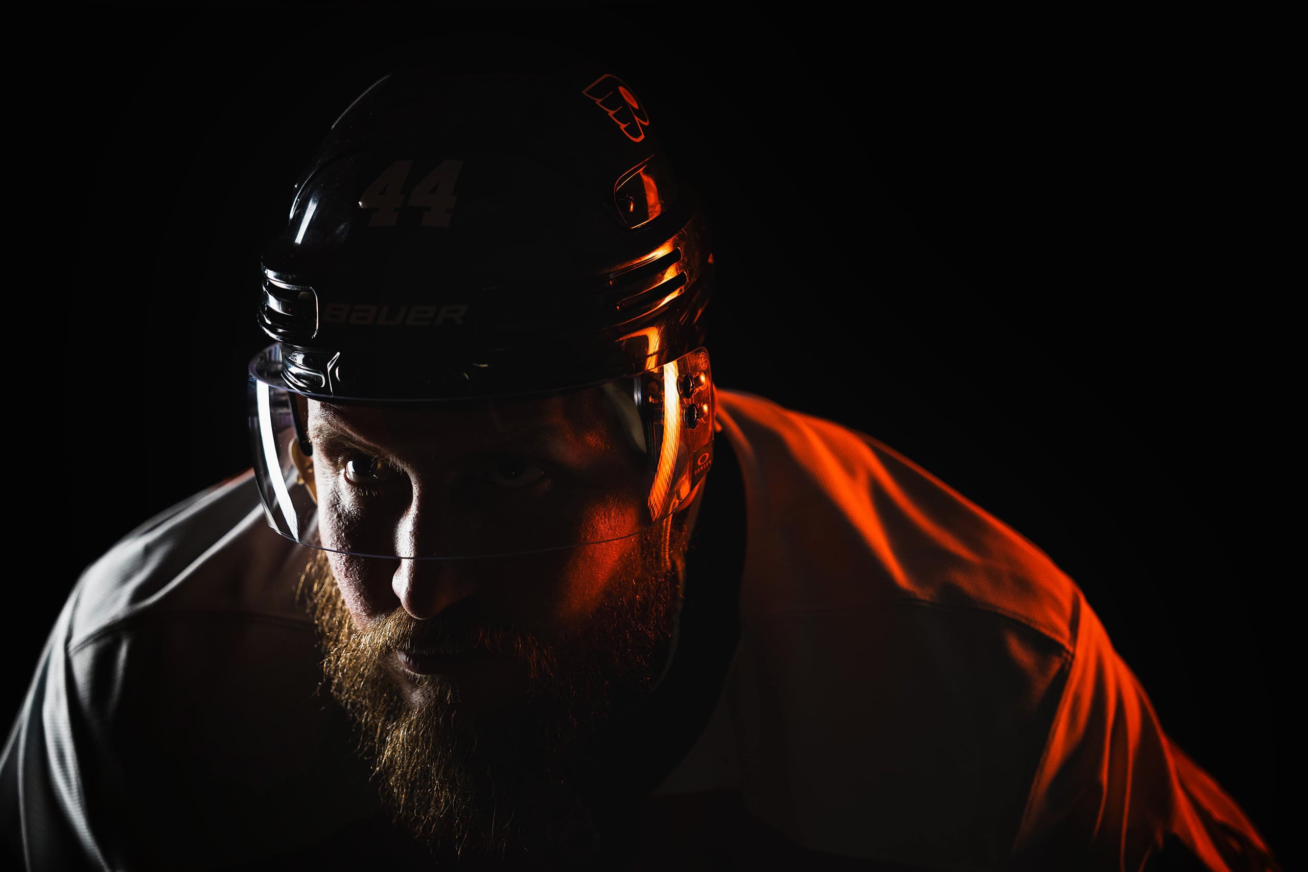
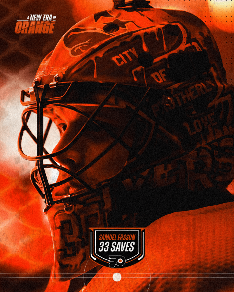
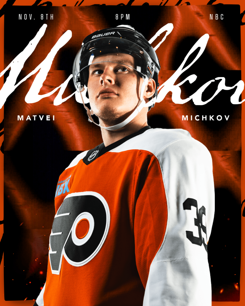
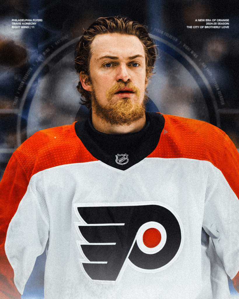
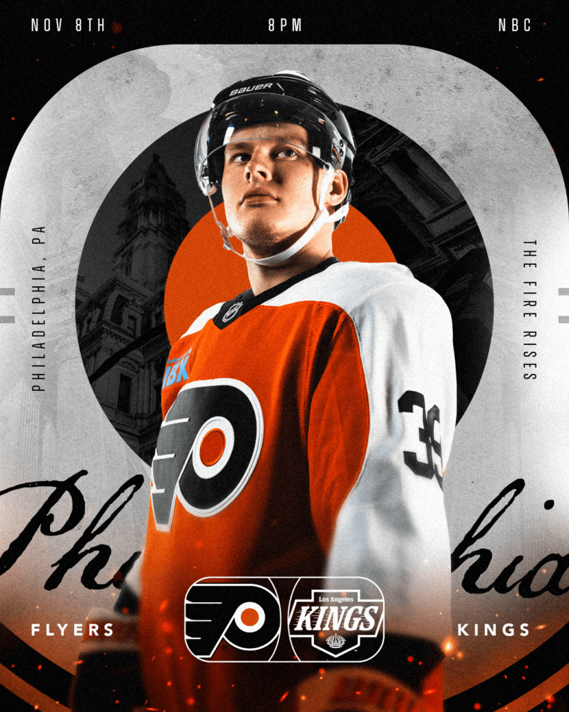
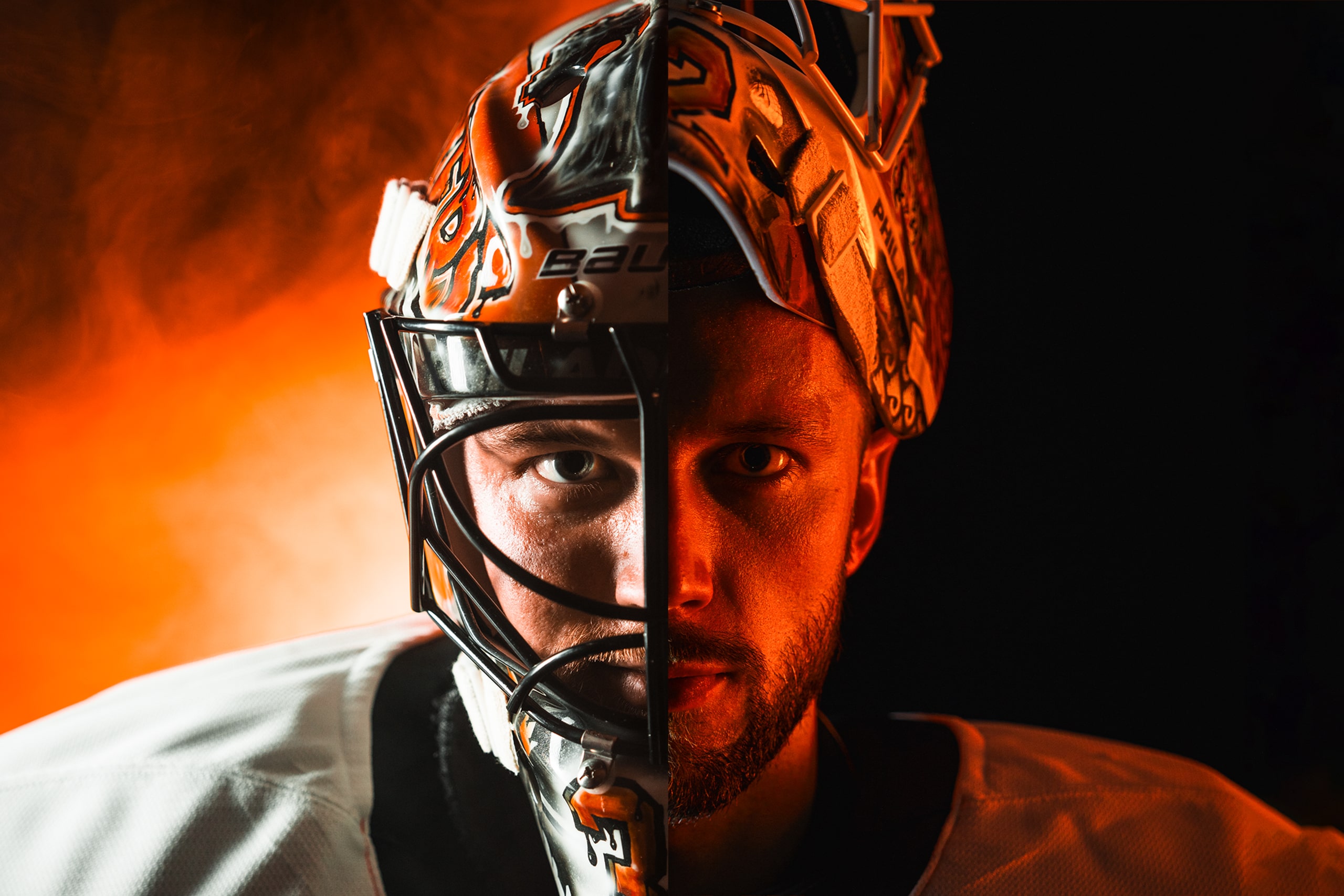
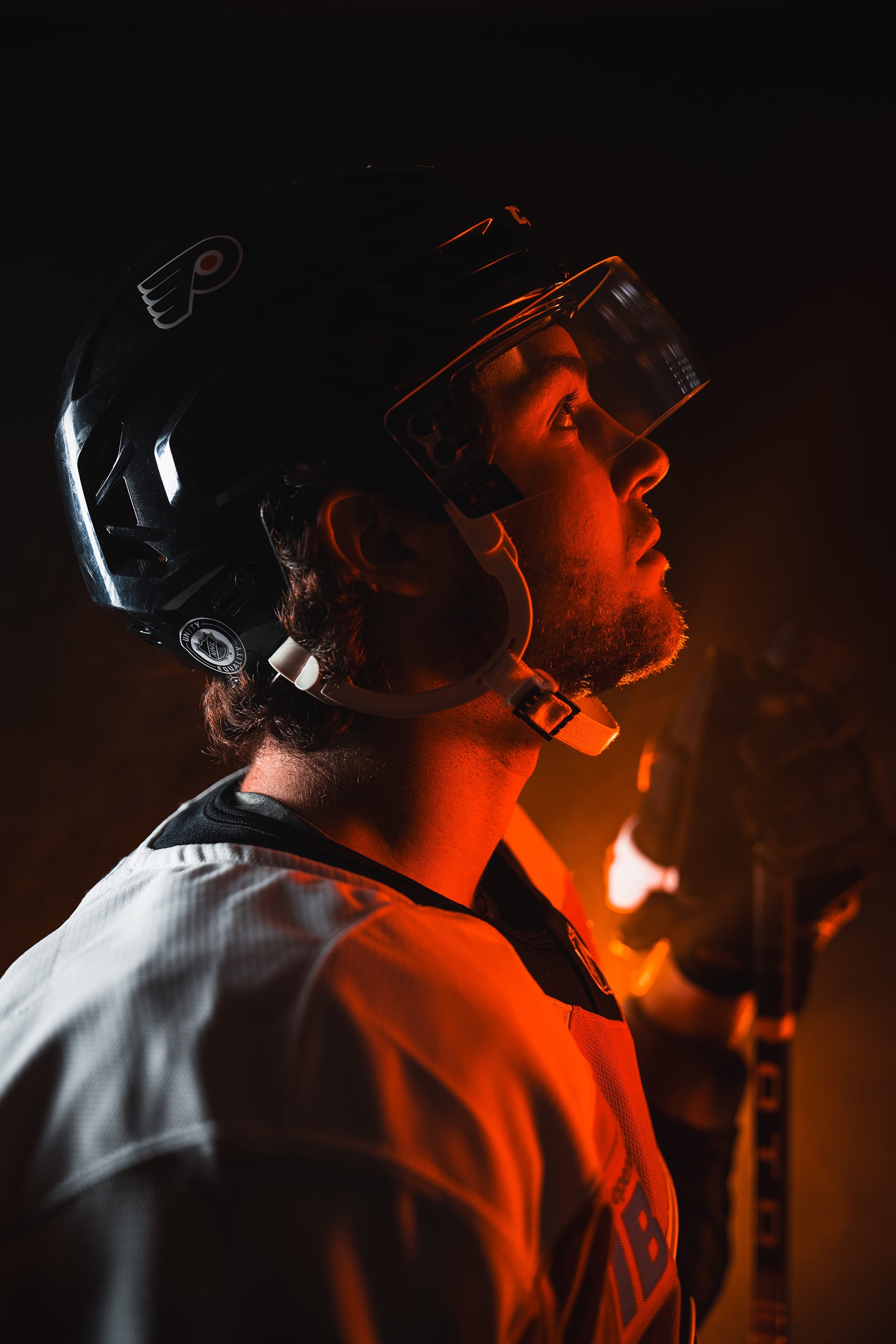
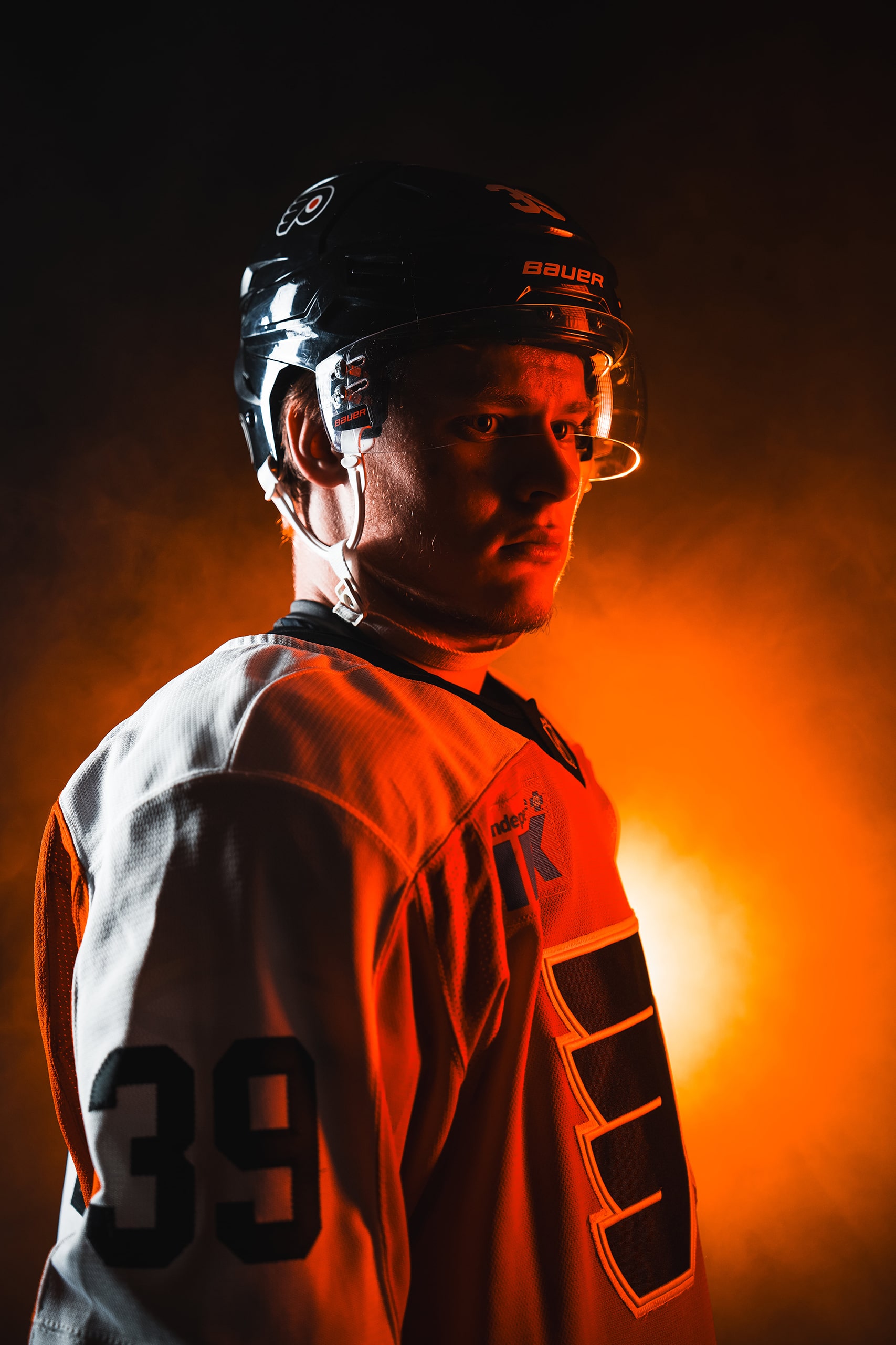
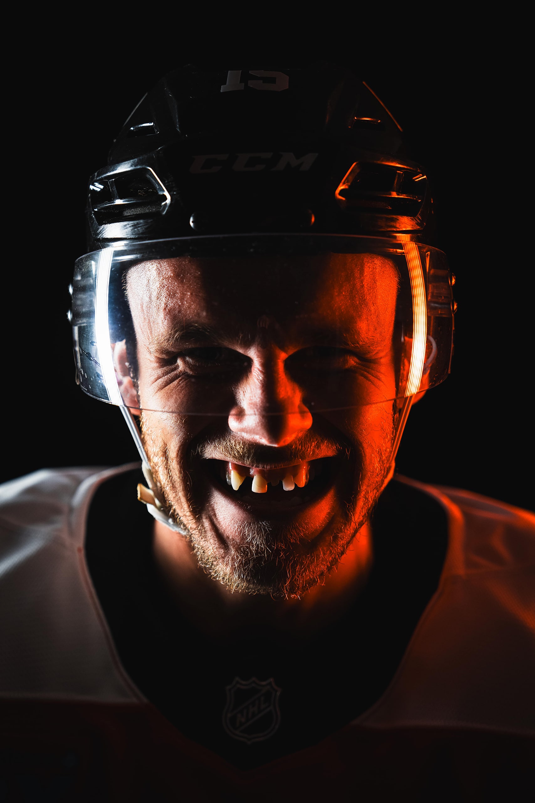
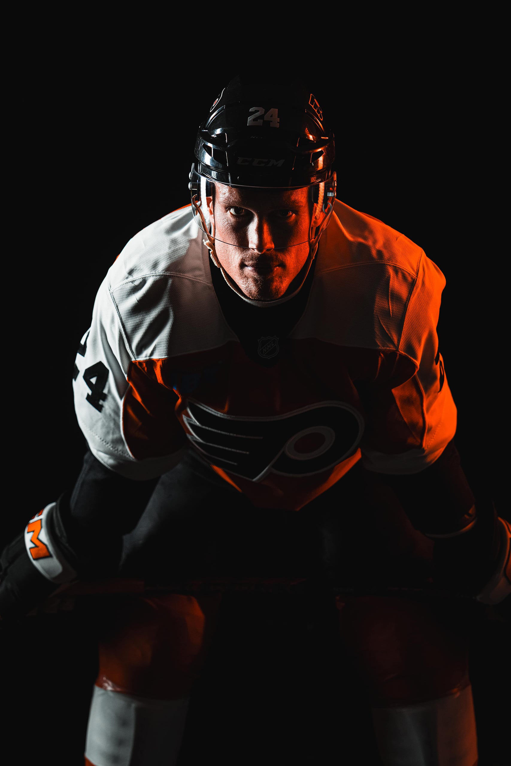
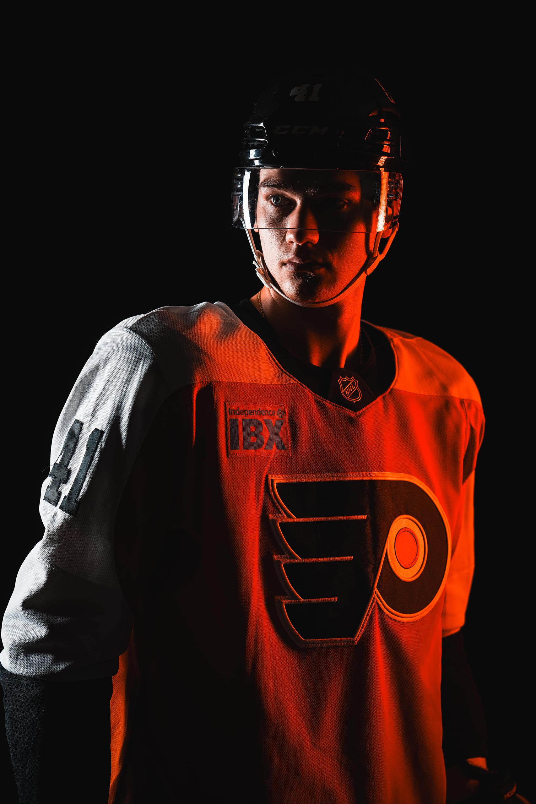
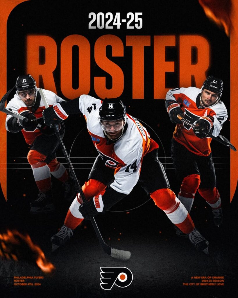
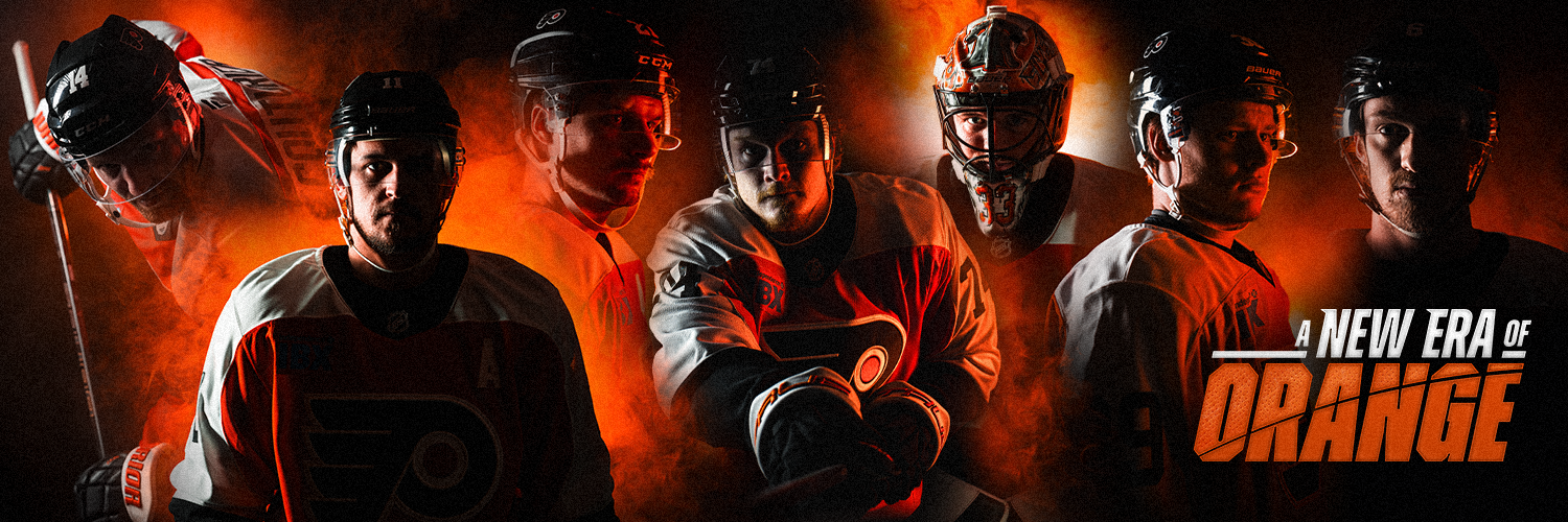
Last season set the foundation for A New Era of Orange on and off the ice. With the surprise early entrance of a highly-touted rookie on the way the 2024-25 season was poised to provide hope and direction for the new era. It was pivotal that we craft our look and feel to help set the scene and introduce the characters that will lead the Flyers forward into the next act.
A NEW ERA OF ORANGE
Before beginning our ideation process I outlined several pillars for the season. This allowed our team to work towards a collective target with plenty of room for different perspectives on how to interpret these adjectives and how to apply them to our season look and feel.
- Emotion
- Authenticity
- Depth
- Grit
- Agility & Versatility
- Semi-Realism
Throughout the process my team worked in tandem testing and merging ideas and approaches to find the solutions that best represented the Flyers and our city. You can find examples below for how we would test ideas with in-season needs as the team merged our concepts and approaches to the season targets.
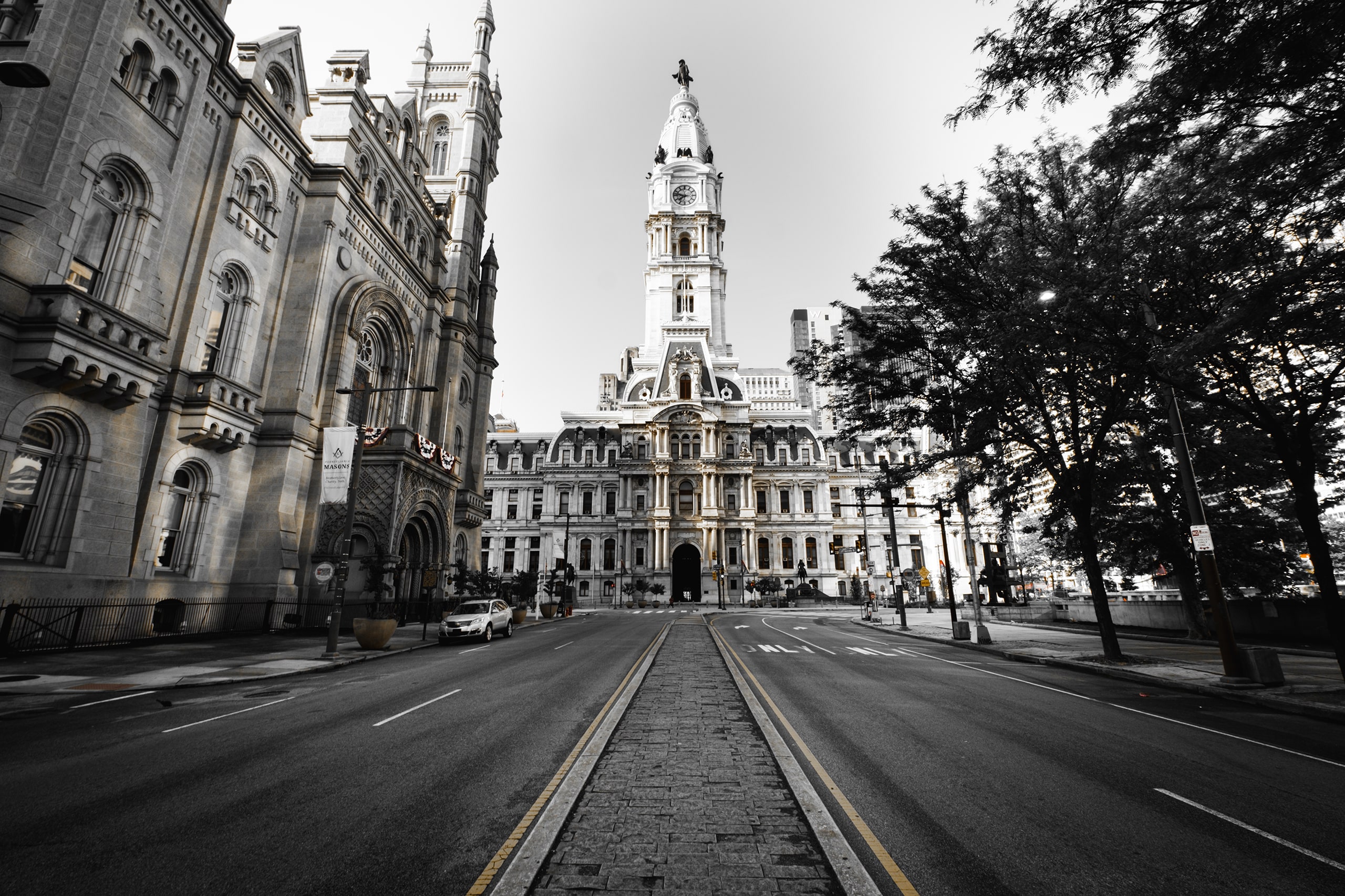
THE CITY OF
BROTHERLY LOVE
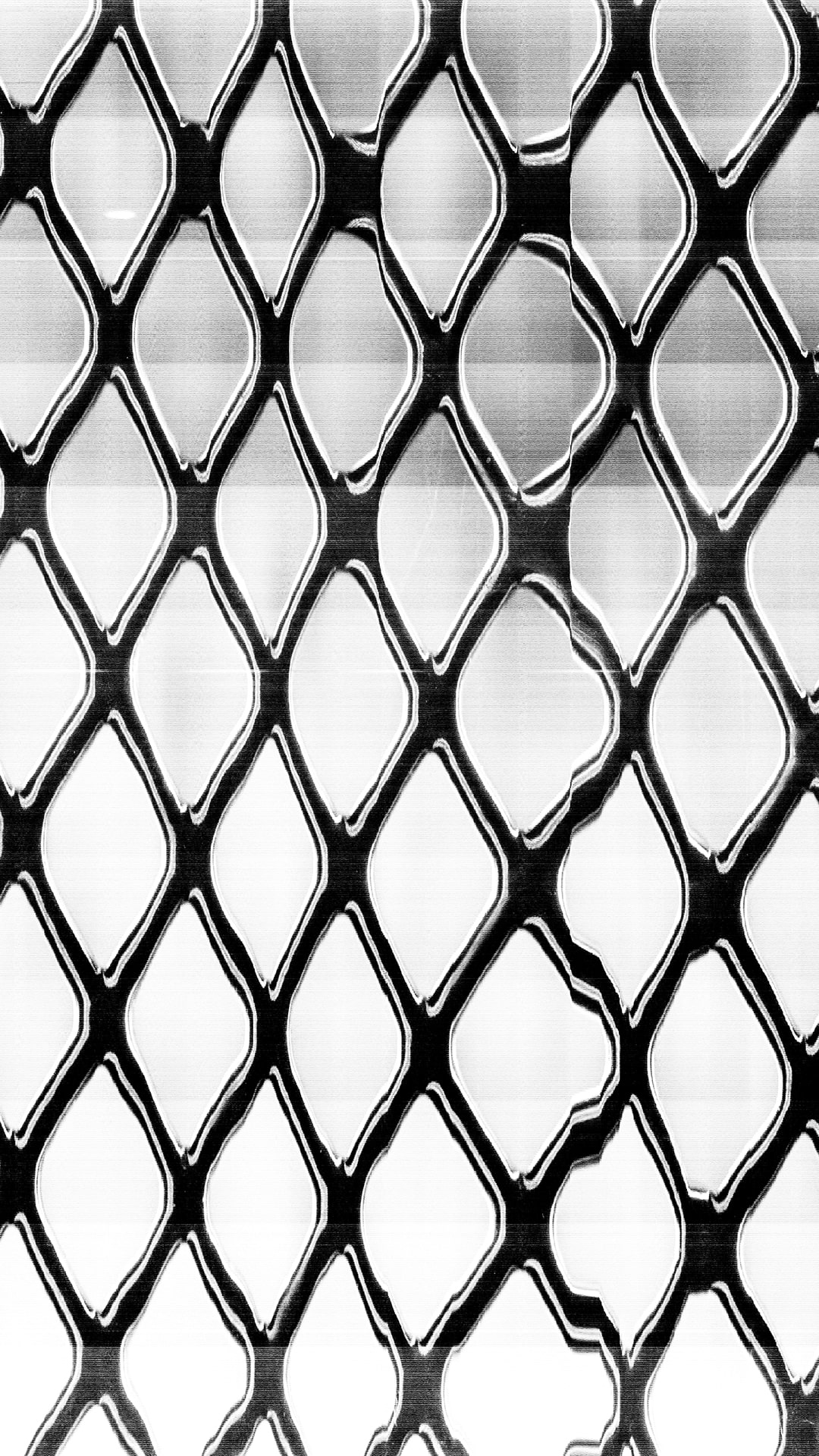
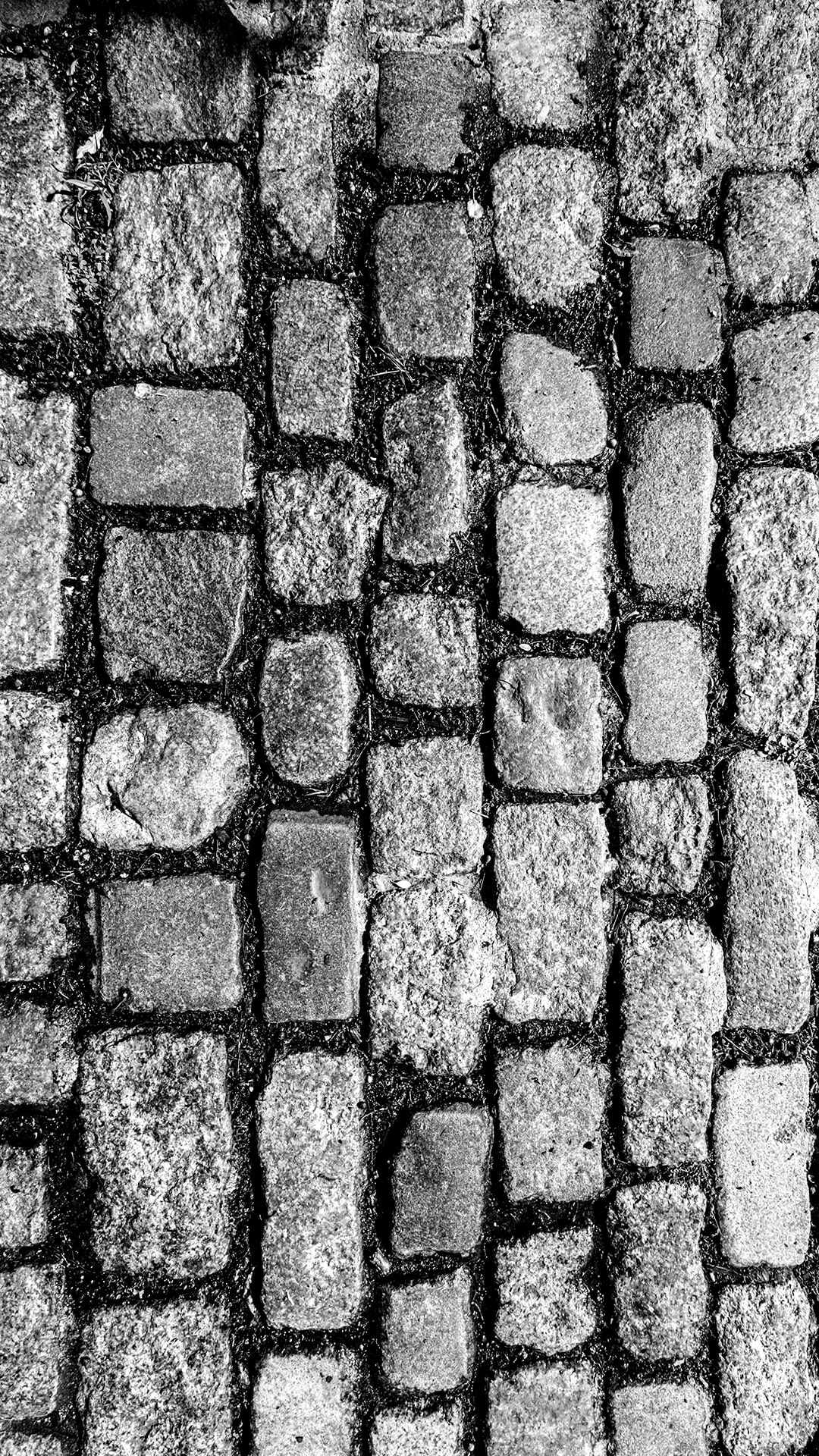
Rooted in authenticity, my team gathered textures throughout Philadelphia by scanning and photographing city elements. We wanted our textural elements to truly represent our passionate city and our sport. These elements helped us add character, texture, and grit to our designs. Our dotted pattern and jersey are continued from 23-24 to help bridge the gap with last year's campaign. Ice shaving and ash brushes were added to our toolkit alongside noise and ice treatments to create depth and texture.
DIRECTION
As ideas were merged and concepts narrowed down I developed the season guide below to create a base of assets and design direction for our team to work from.
The extensive brand guide below allowed our creative teams to align with one another across graphics, video, animation, and game presentation. As our team created for the Flyers, Wings, and Wells Fargo Center it was pivotal that our teams could make quick design decisions using the guide.

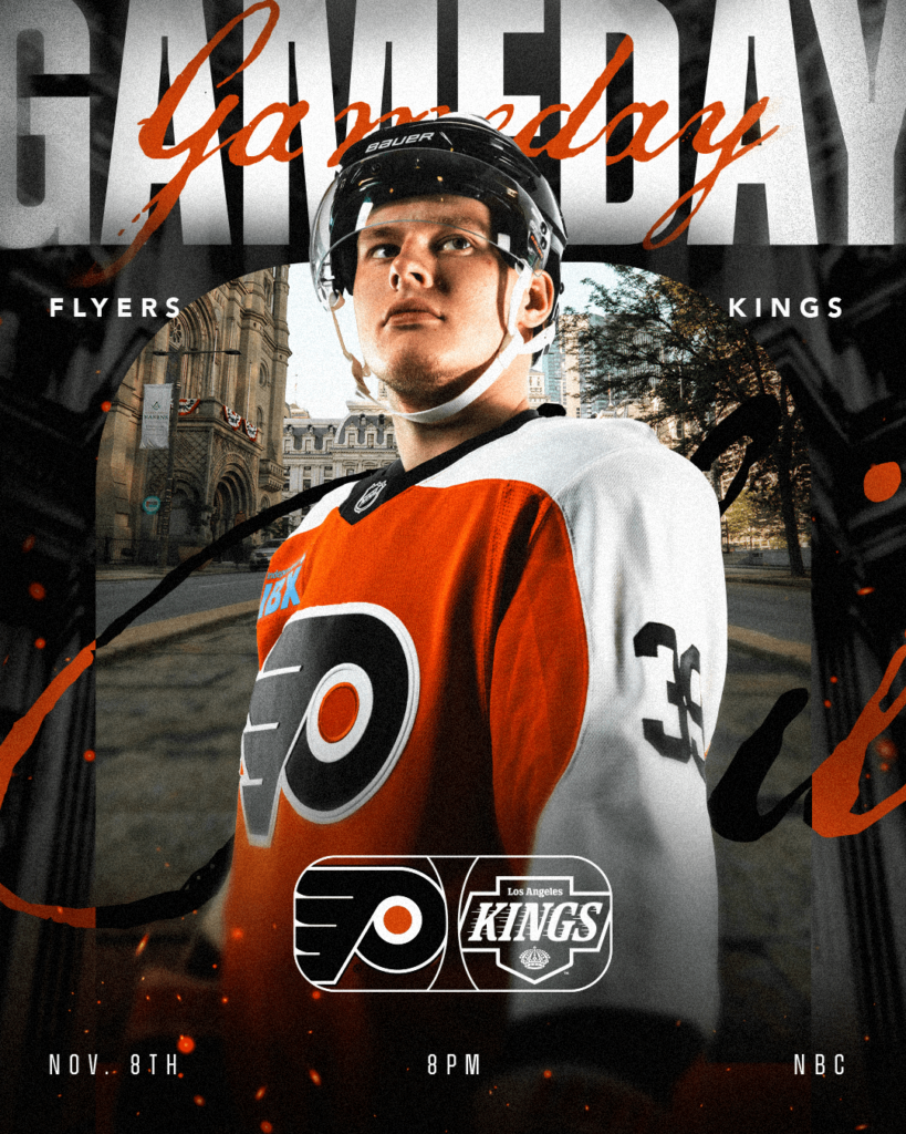
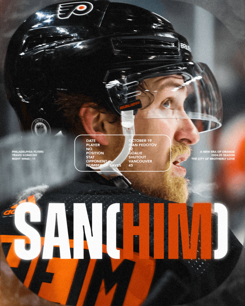
SEASON GRAPHICS
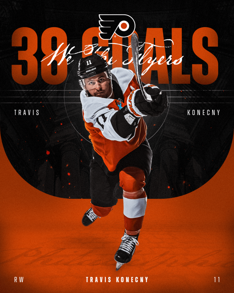
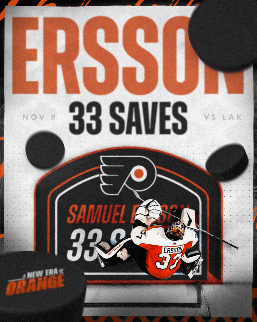
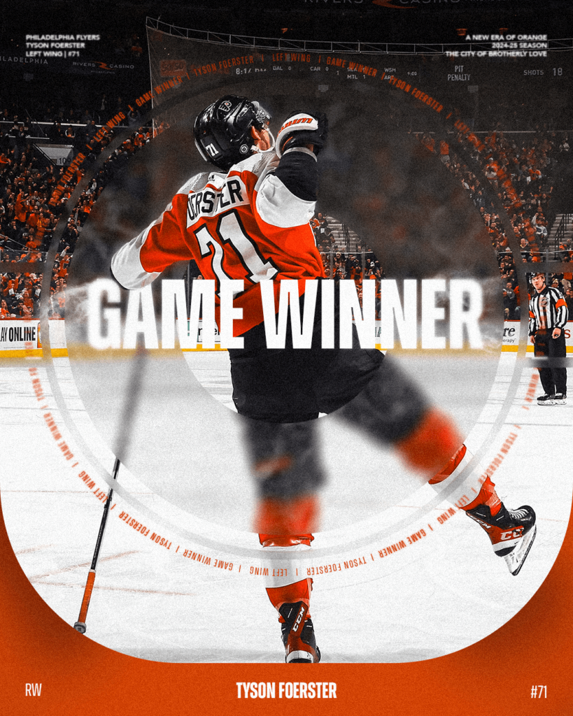
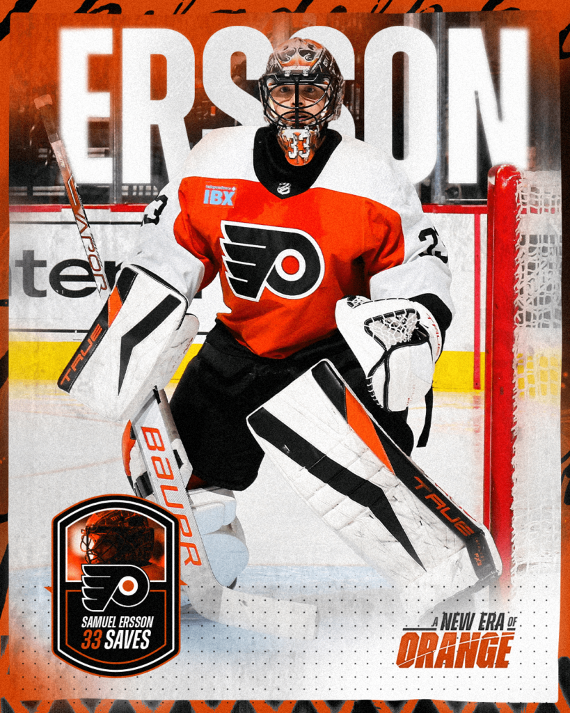
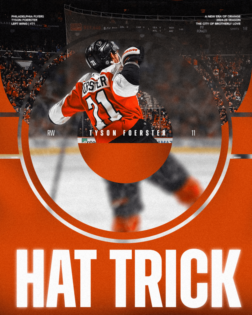
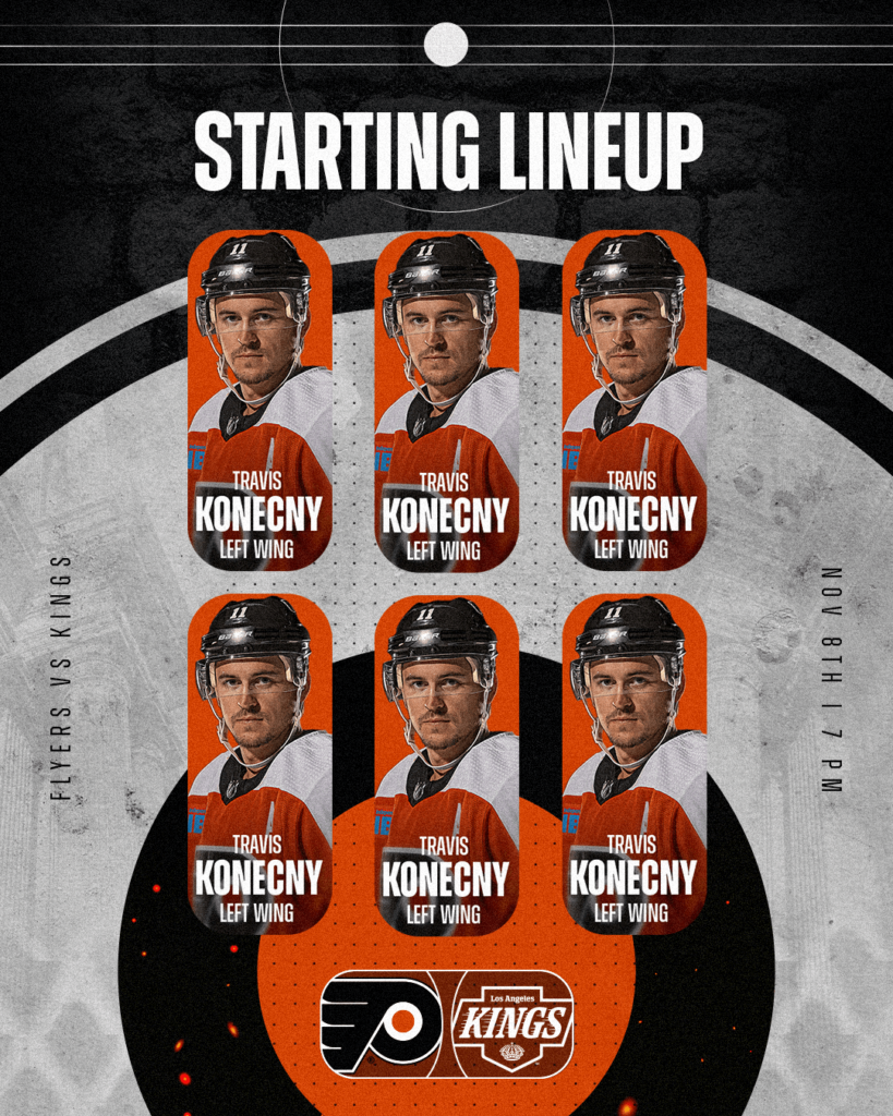
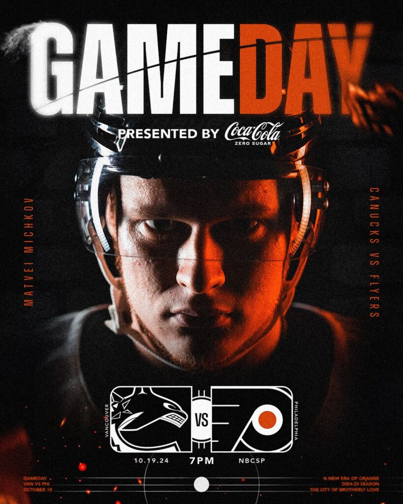
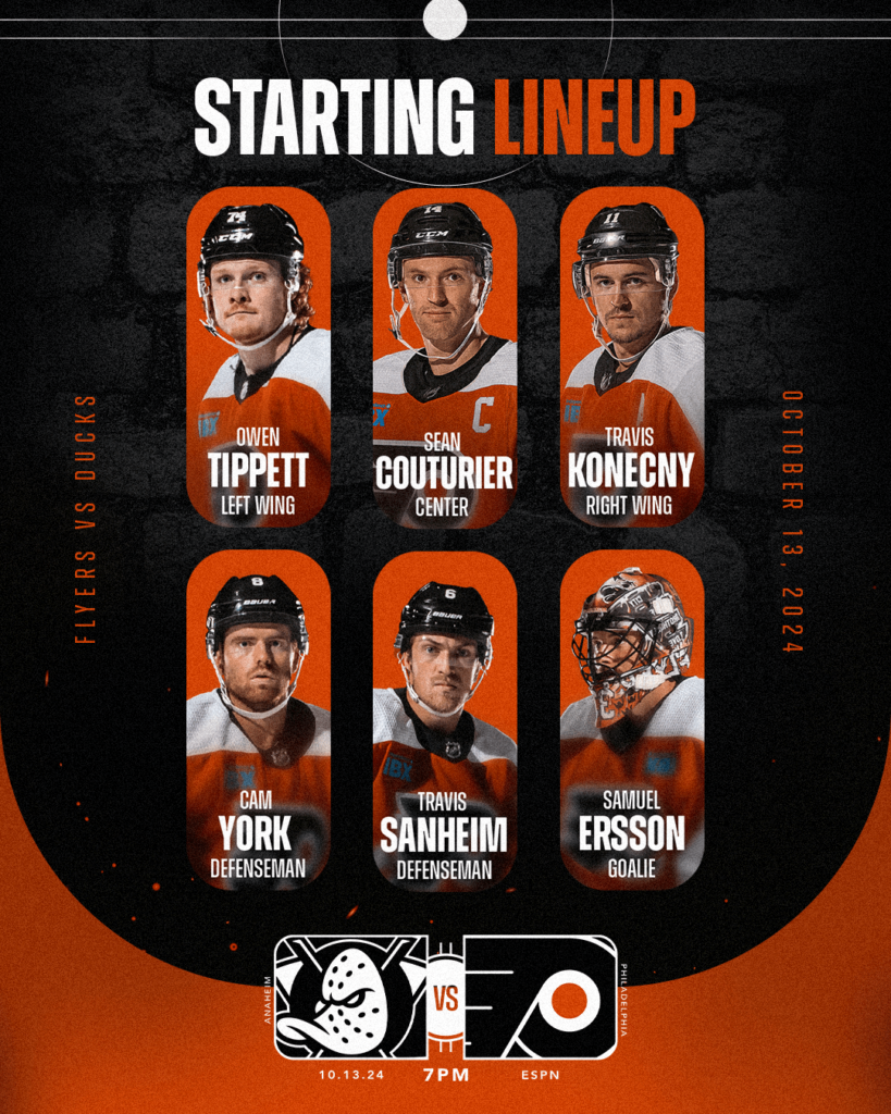
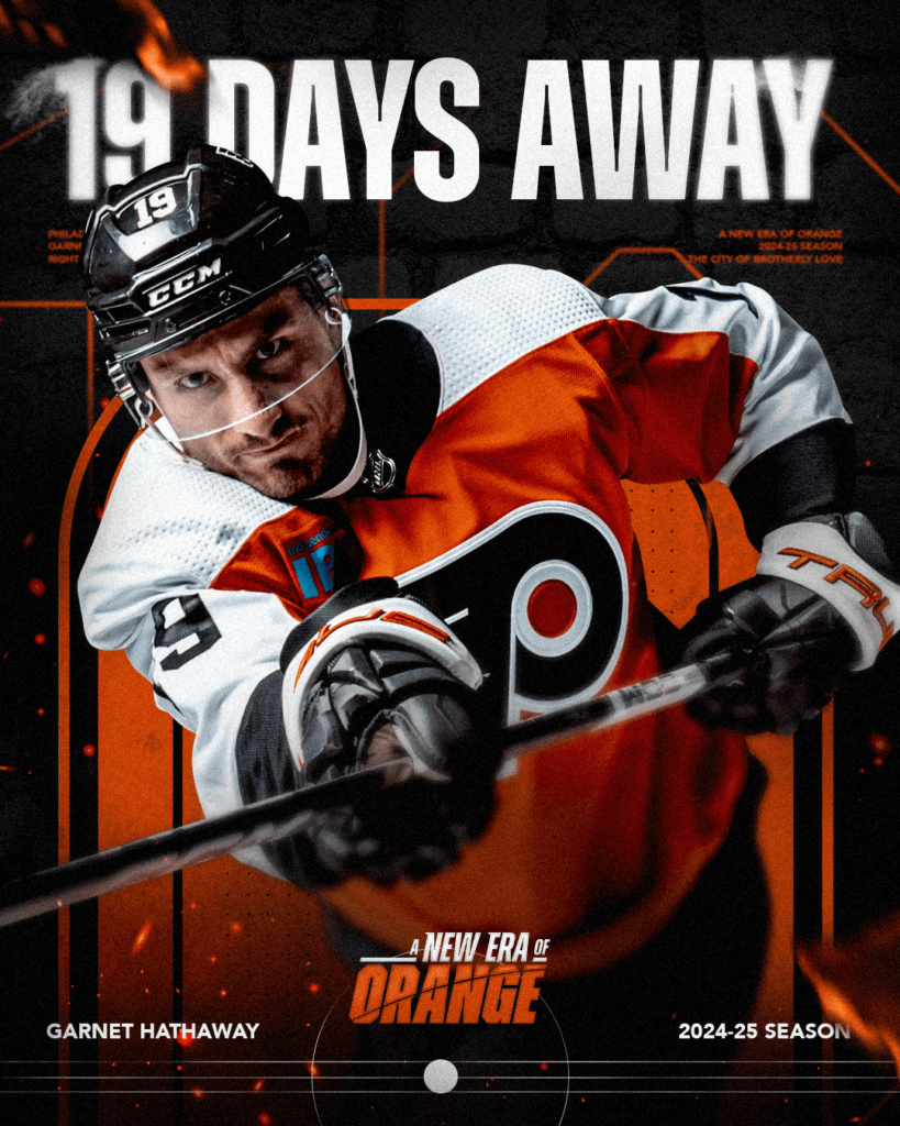
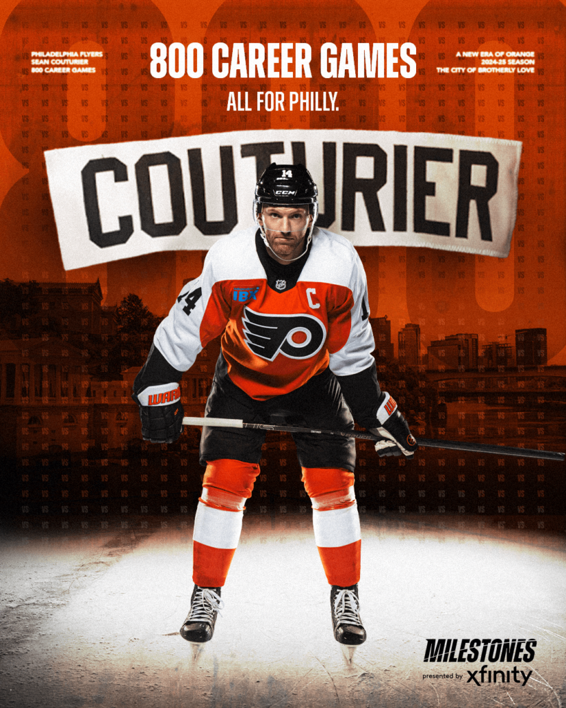
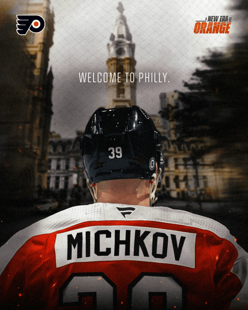
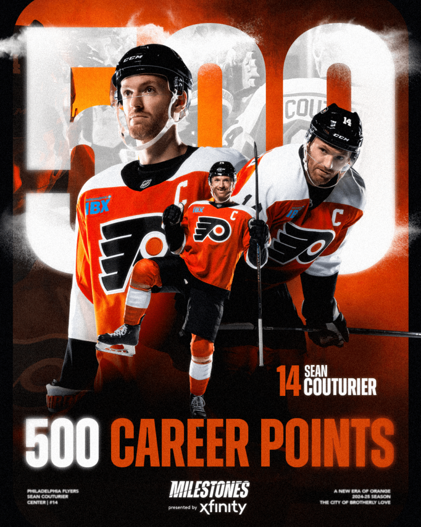
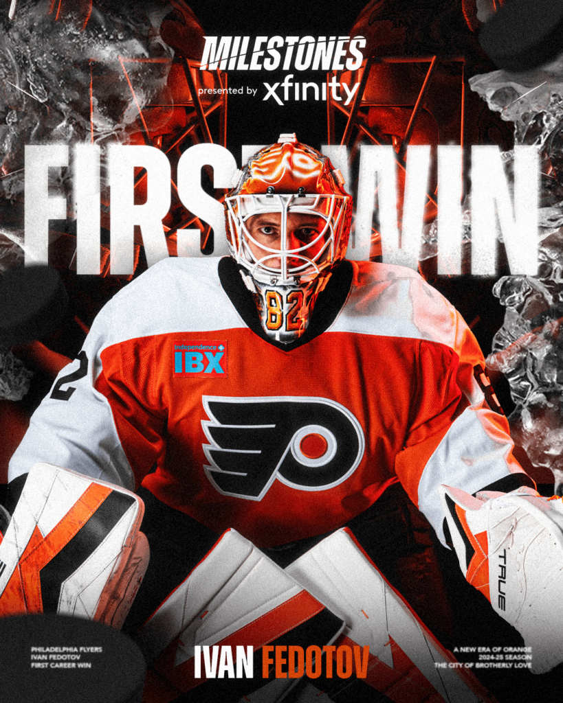
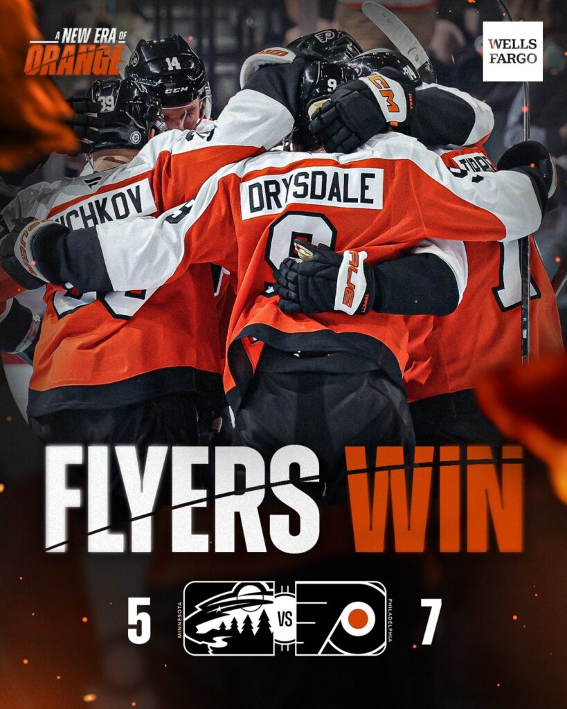
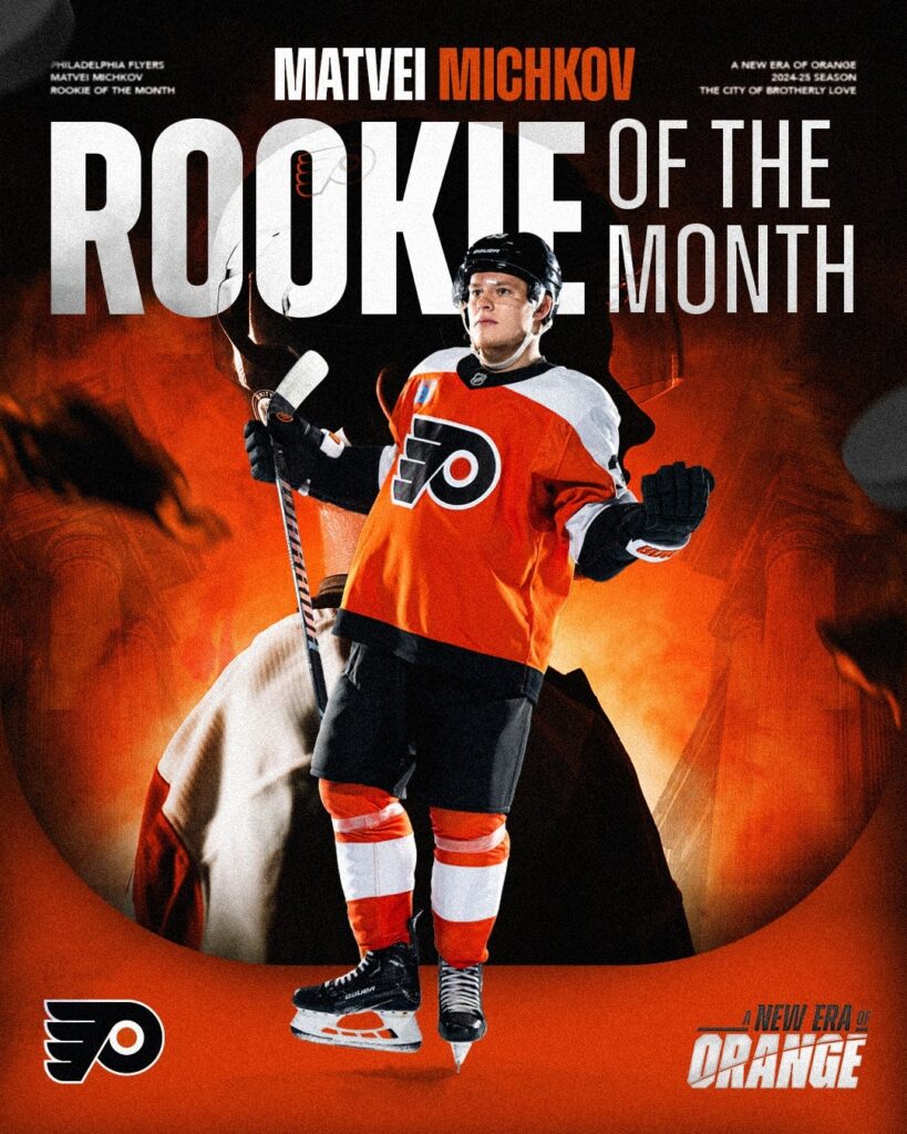
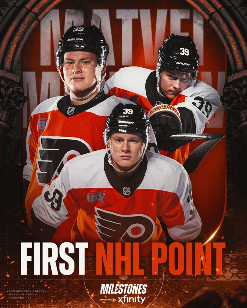
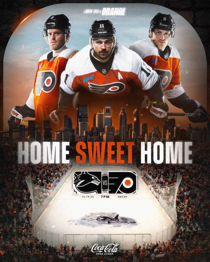
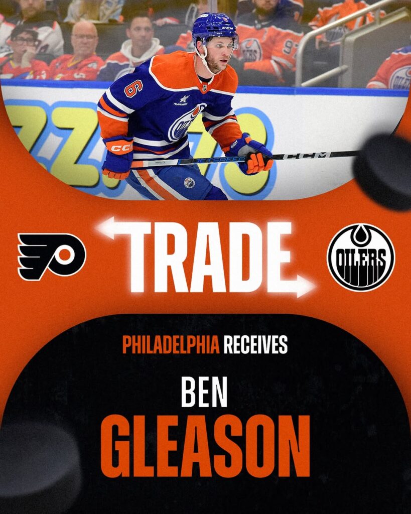
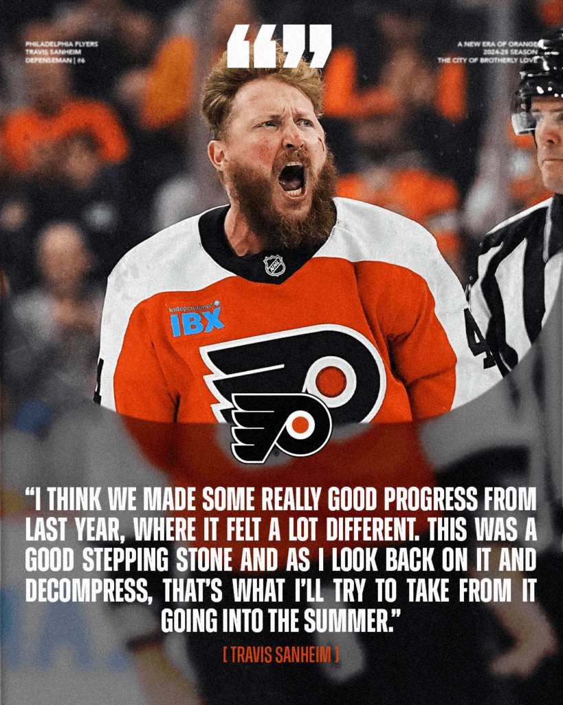
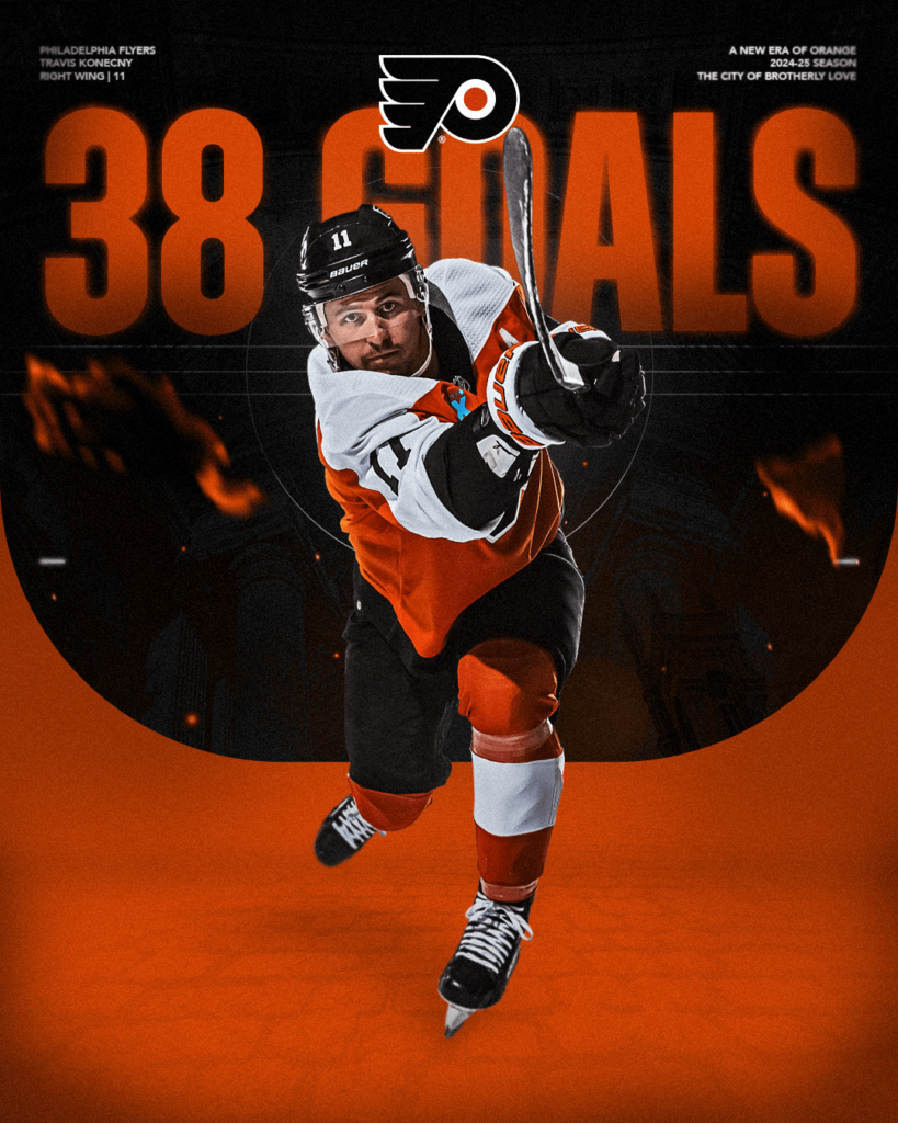
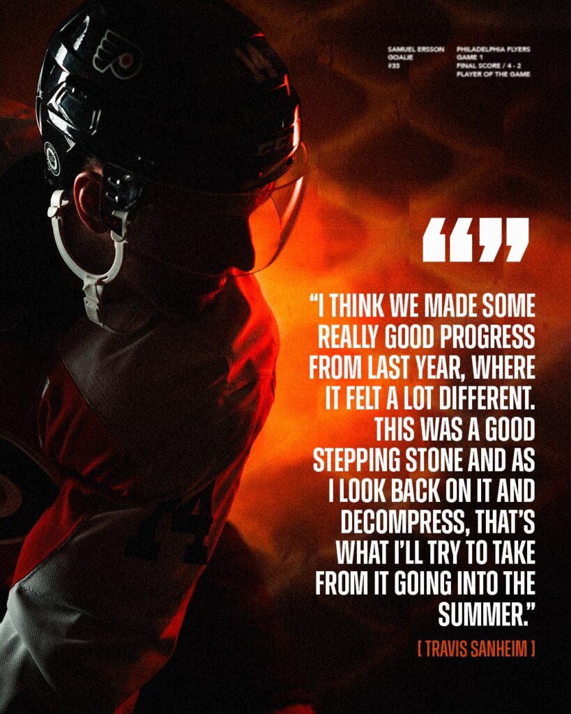
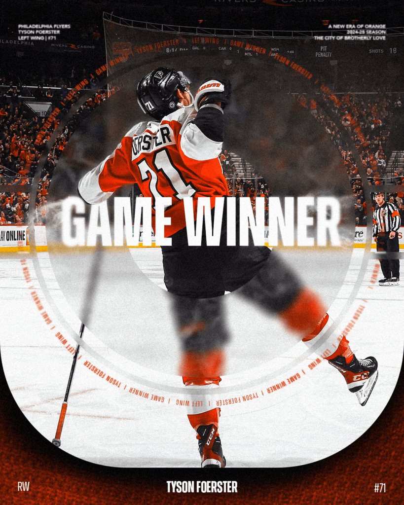
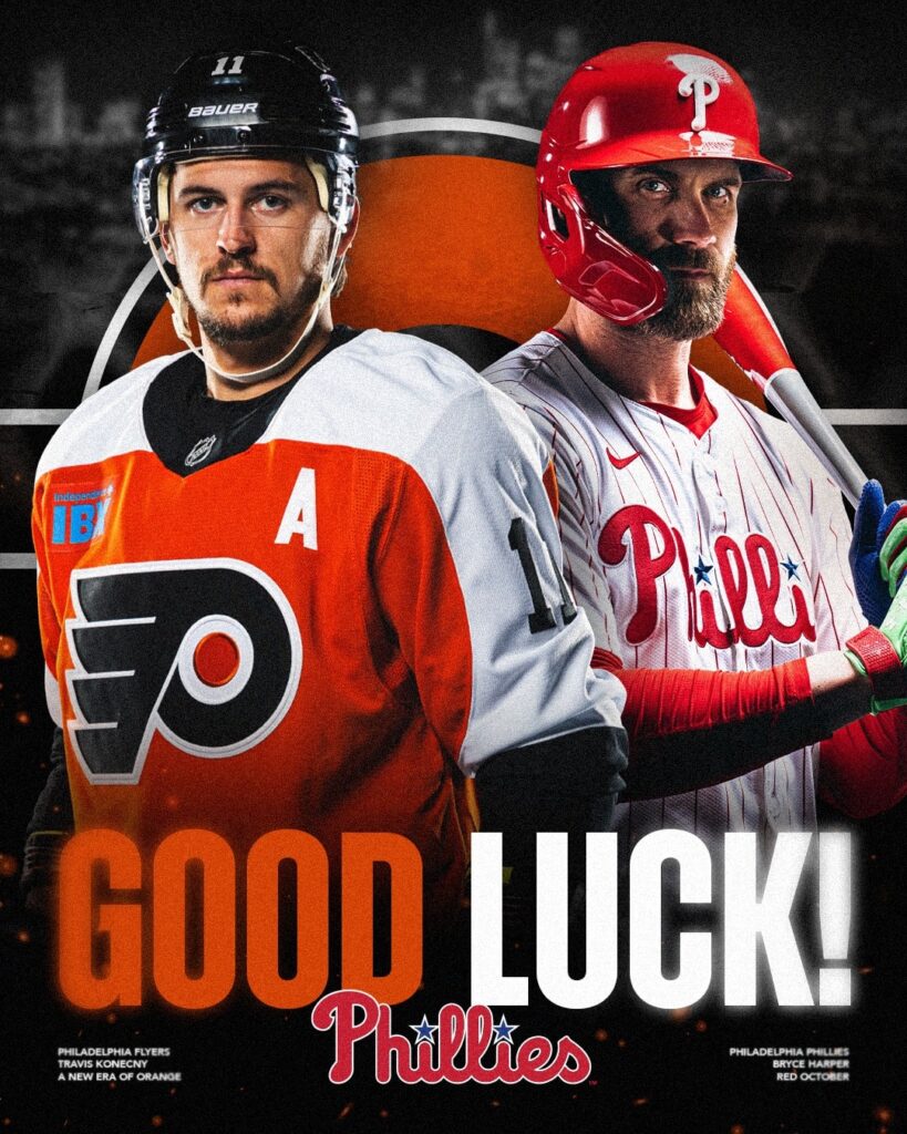
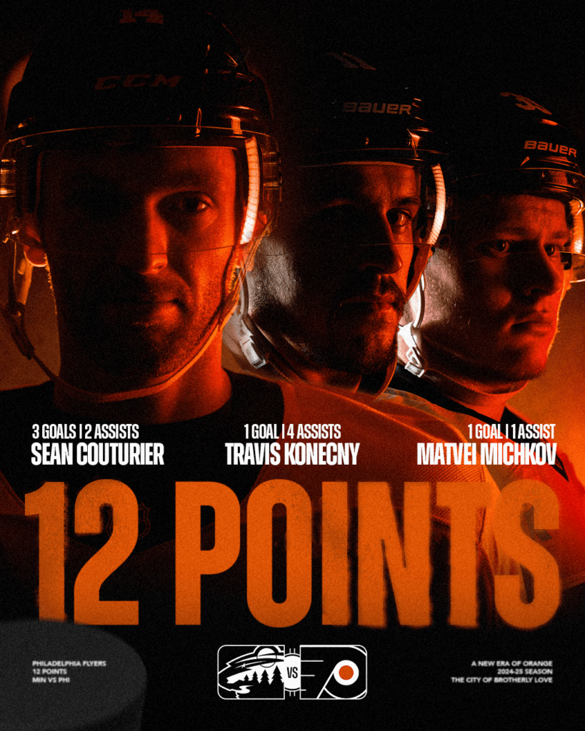
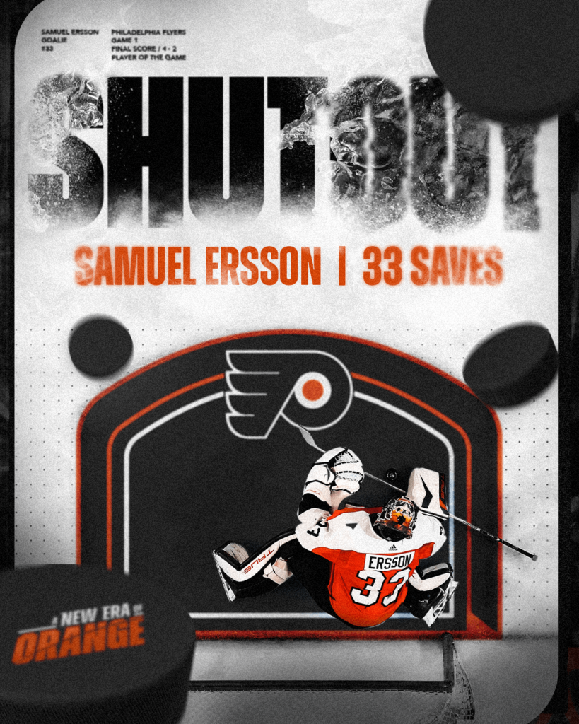
Our season graphics brought a new level of emotion and depth to the Philadelphia Flyers brand. The assets and concepts we developed allowed us to create designs that felt cohesive though we remained agile enough to constantly evolve our look and prevent designs from becoming stale.
None of this would have been possible without the incredibly passionate and talented team of creatives I had the opportunity to lead. I want to thank my entire team for their dedication to the Flyers organization.
- Hannah Pugh
- Frank White
- Keenen Jones
- Shannon Corr
- Joe Merwin