LOADING, PLEASE WAIT...
PHILADELPHIA WINGS

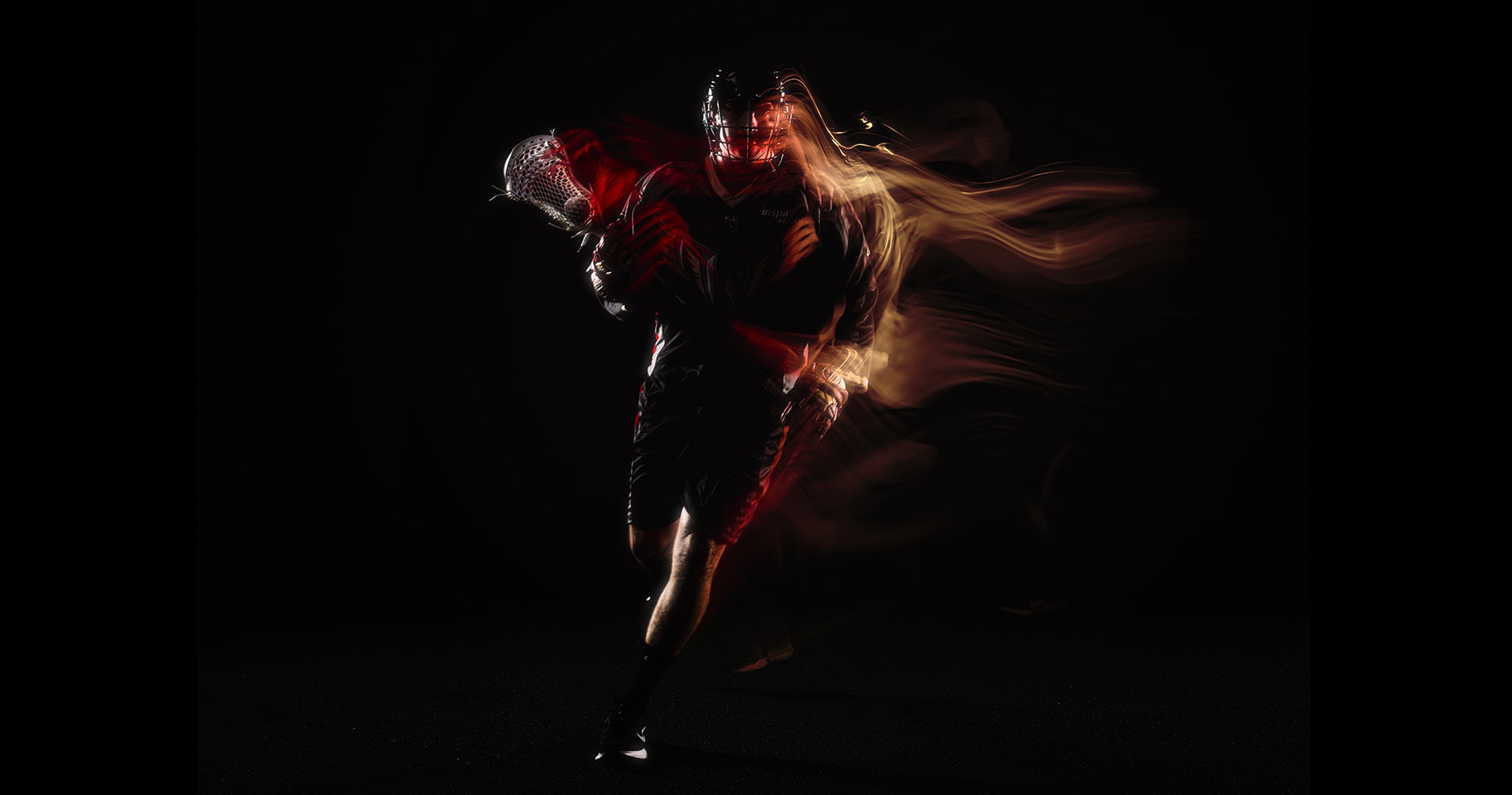
With a tough season behind us it was time for a culture change within the Wings organization. With the first overall pick and nowhere to go but up, it was our chance to bring a free-wheeling, high-energy approach to our 2024-25 season. We were ready to Let it Fly and become strategically reckless.

With a tough season behind us it was time for a culture change within the Wings organization. With the first overall pick and nowhere to go but up, it was our chance to bring a free-wheeling, high-energy approach to our 2024-25 season. We were ready to Let it Fly and become strategically reckless.

LET IT FLY

Our designs aimed to create organized chaos with intent and meaning behind the many elements and layers we developed.

The new season was an opportunity for us to craft the purpose within the chaos. Every texture, element, and treatment that make up our season look was crafted with meaning - a strategy within the recklessness. We have drawn inspiration from our sport, our city, and the name we proudly wear on our jerseys.

CREATING THE CHAOS

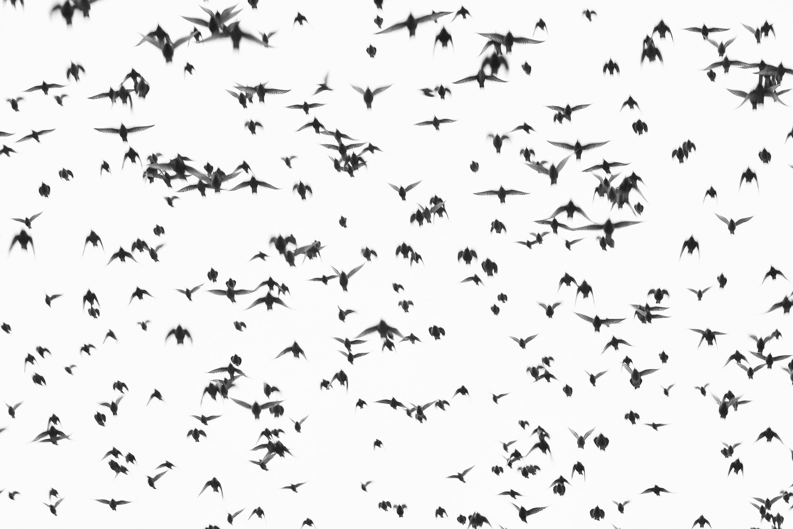
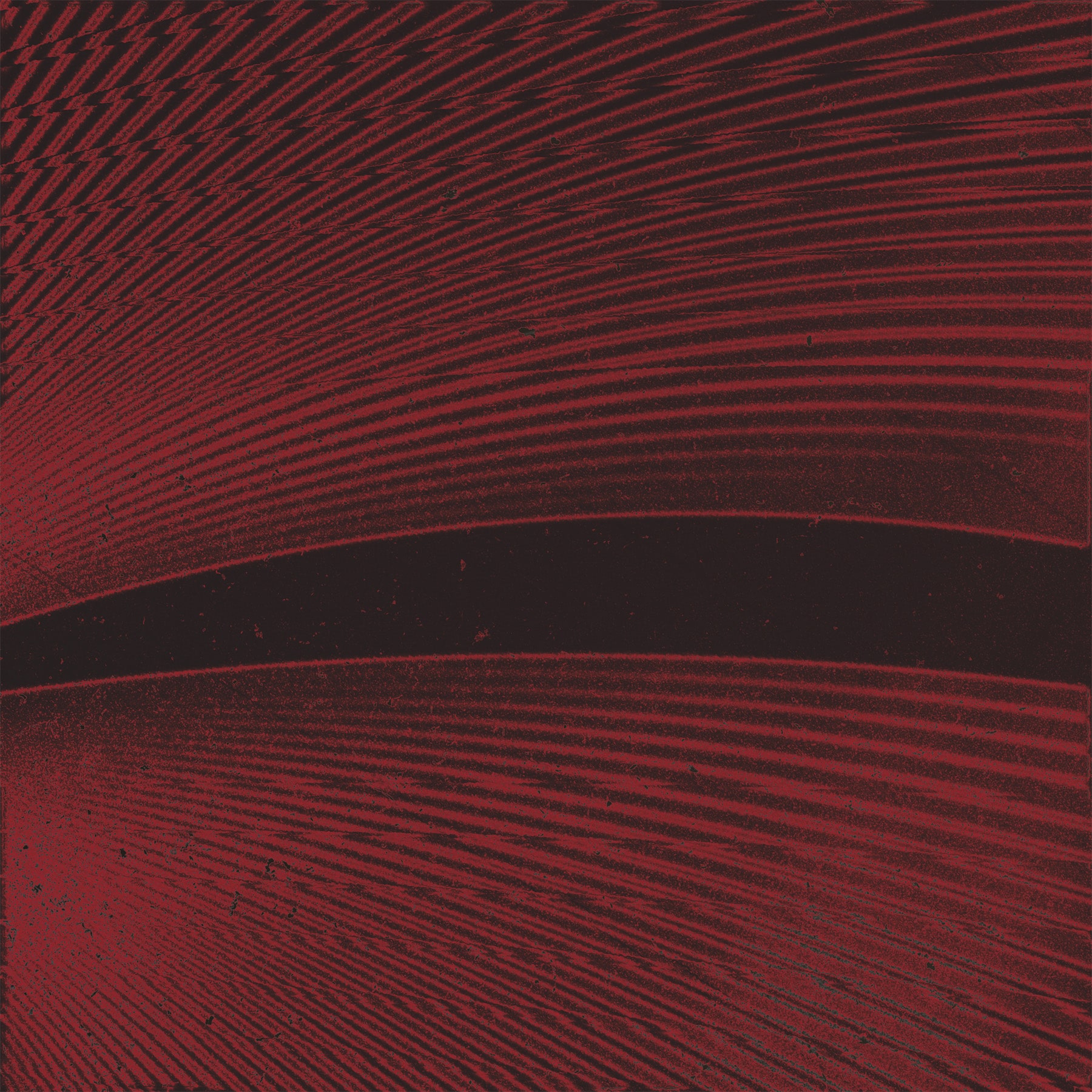
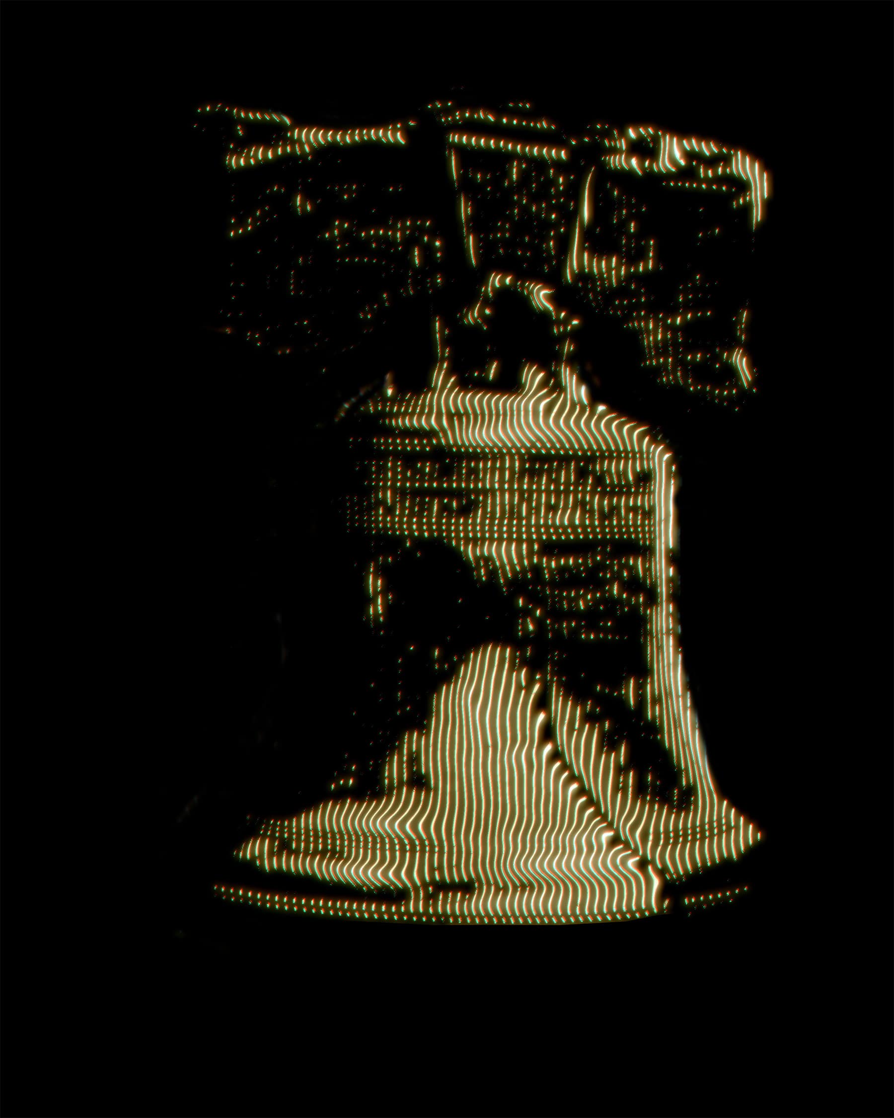
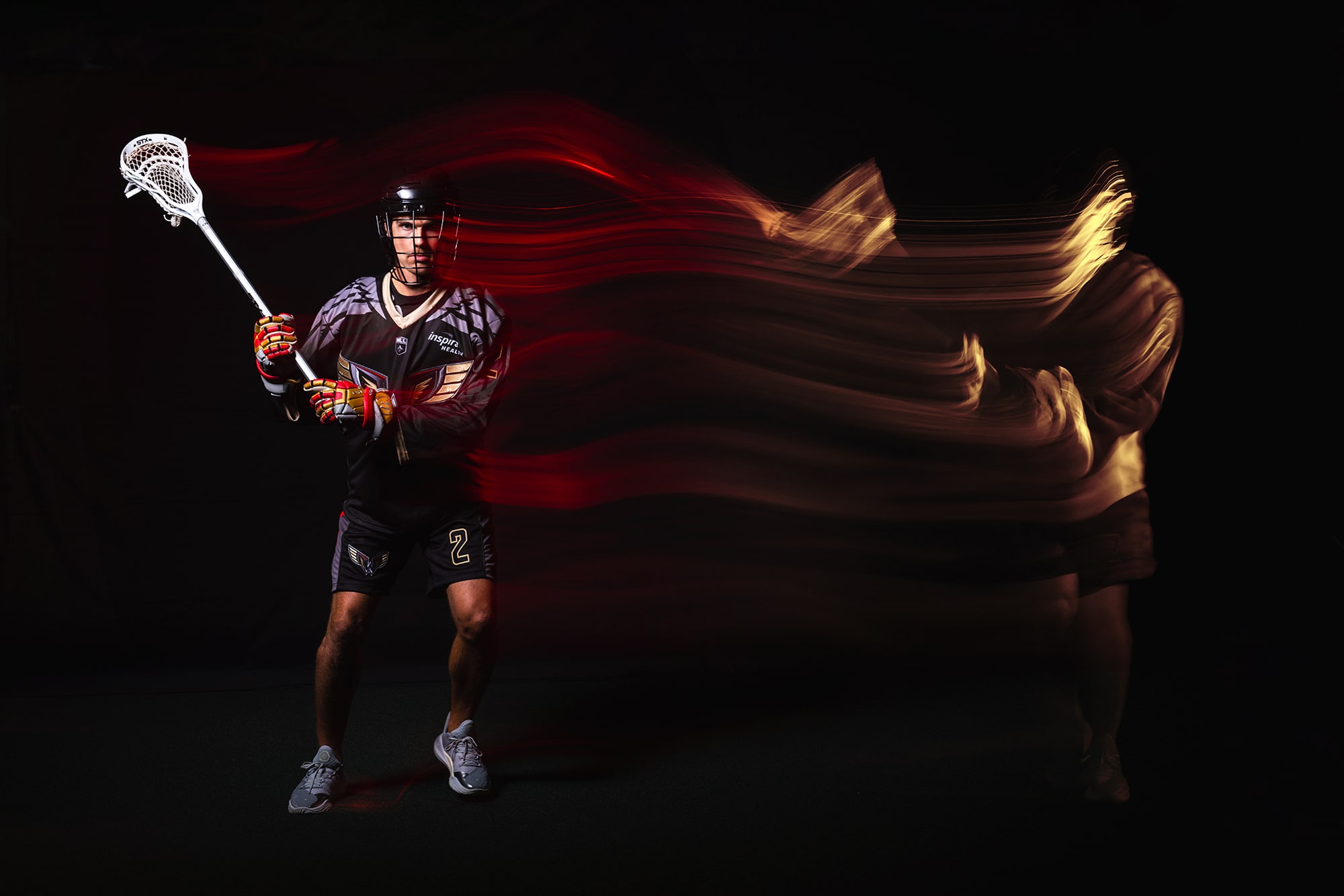
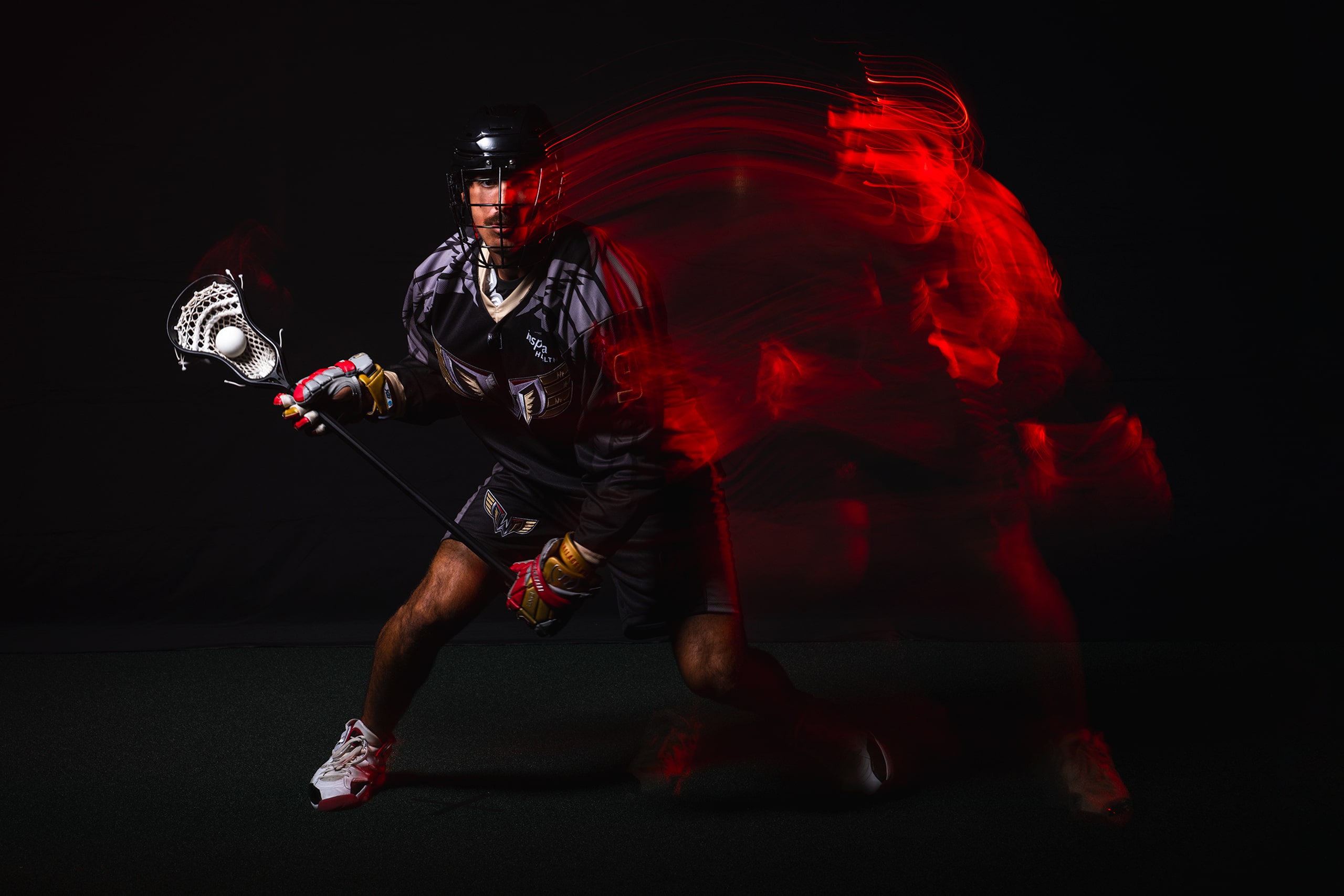
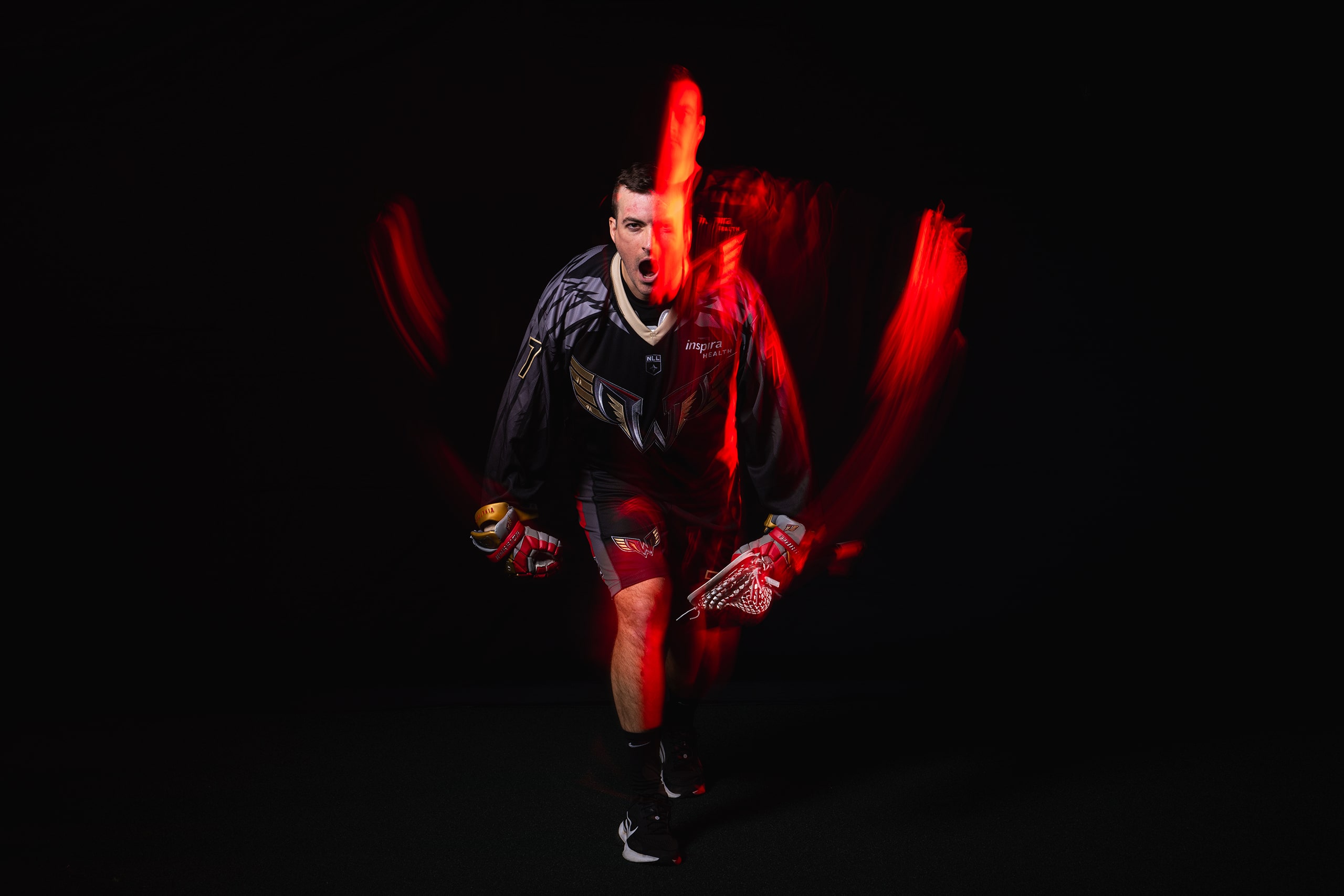
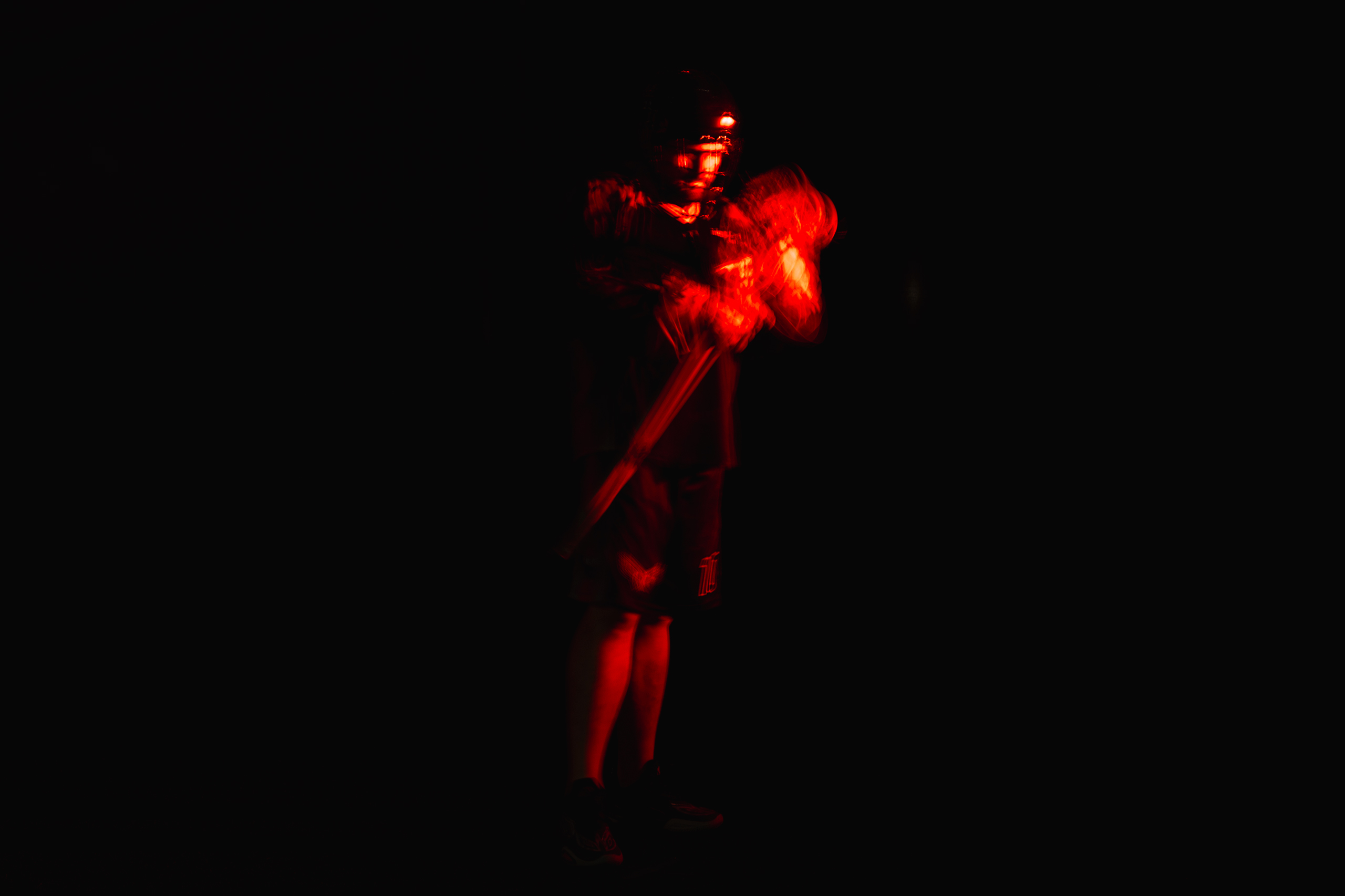
To craft the chaos we have developed these assets and textures that work cohesively to complete a strategically reckless composition. Each asset and texture was designed with a purpose within the layers. Netting and the field lines connect with our sport. Background imagery of our architecture, distorted elements like the liberty bell and city hall, and textures of grit represent our city. The air flow around an airfoil creates a texture representing a wing alongside feathers from within our uniform. Our hand drawn elements bring additional depth to our compositions and can be used to help highlight information, overlay imagery, add related elements for theme nights, and much more . This is a very agile addition to our season look that will continue to be added to throughout the season. We use speed and motion as treatments to our images, textures, and design elements to reflect the high-tempo of lacrosse and the movement of our wings.

ORGANIZING THE CHAOS

Below is our brand guide to help outline and organize all of the elements and design decisions my team and I made during the development of this look.

Given the length of time our season takes on it was important to leave enough room for our designs and elements to continue to grow so as not to become stale - though not ambiguous enough that we lose our aesthetic.

SEASON GRAPHICS

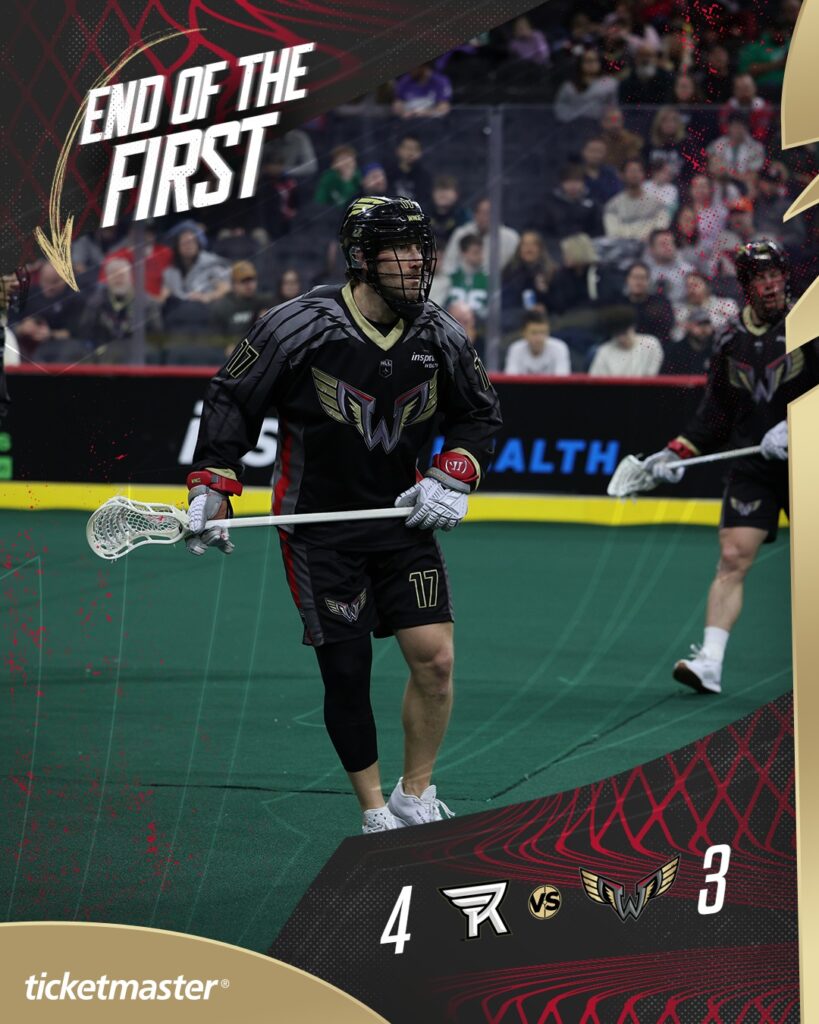
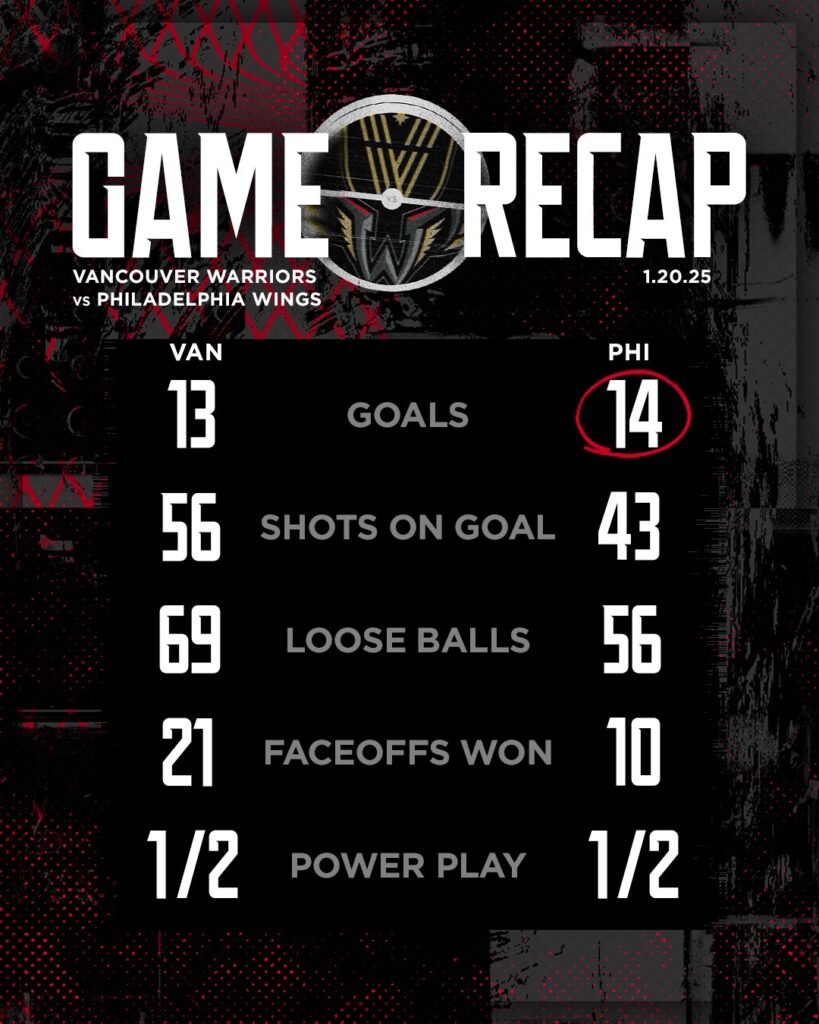
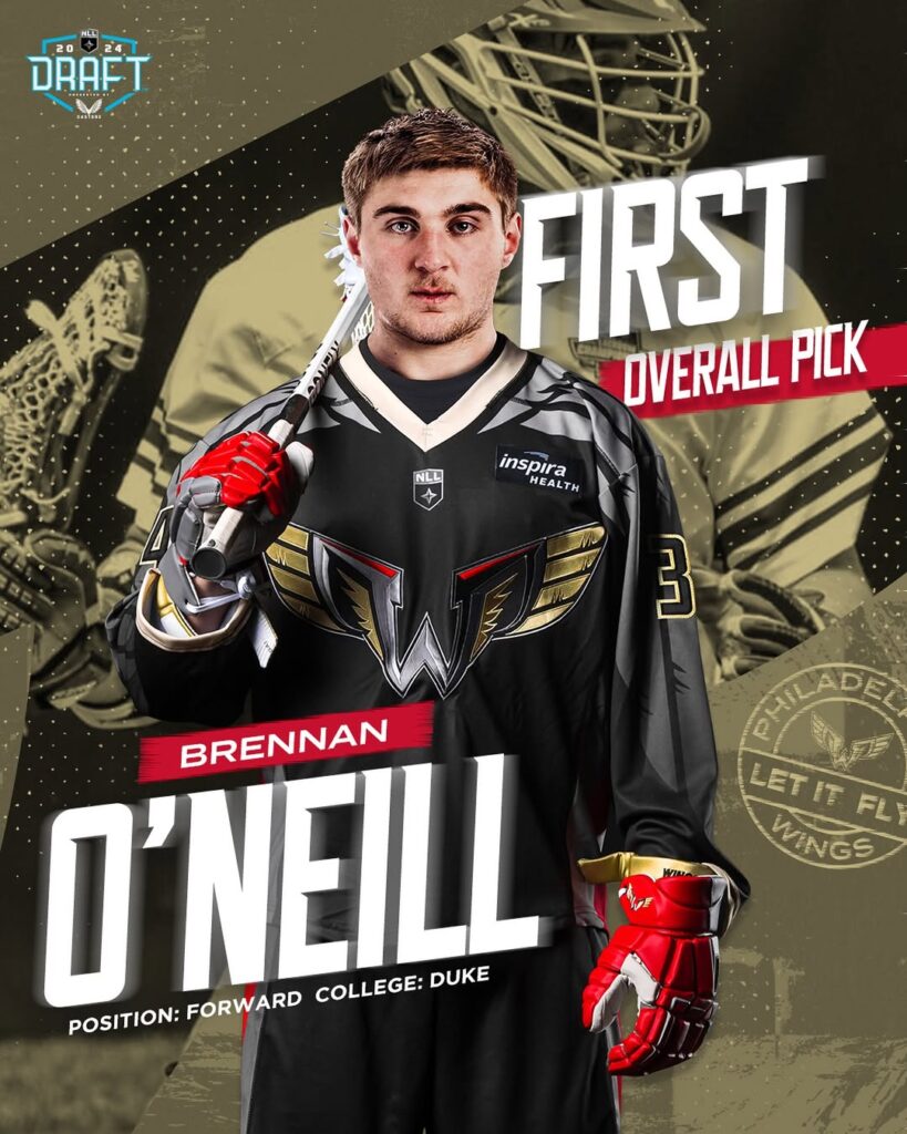
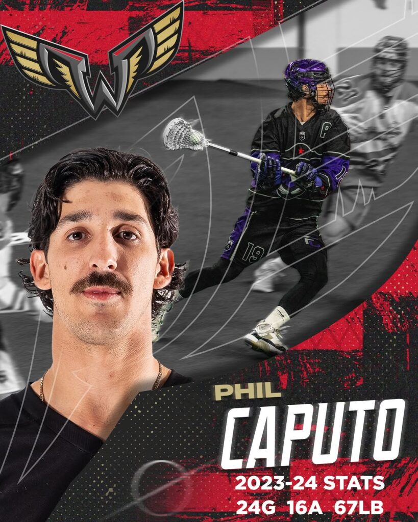
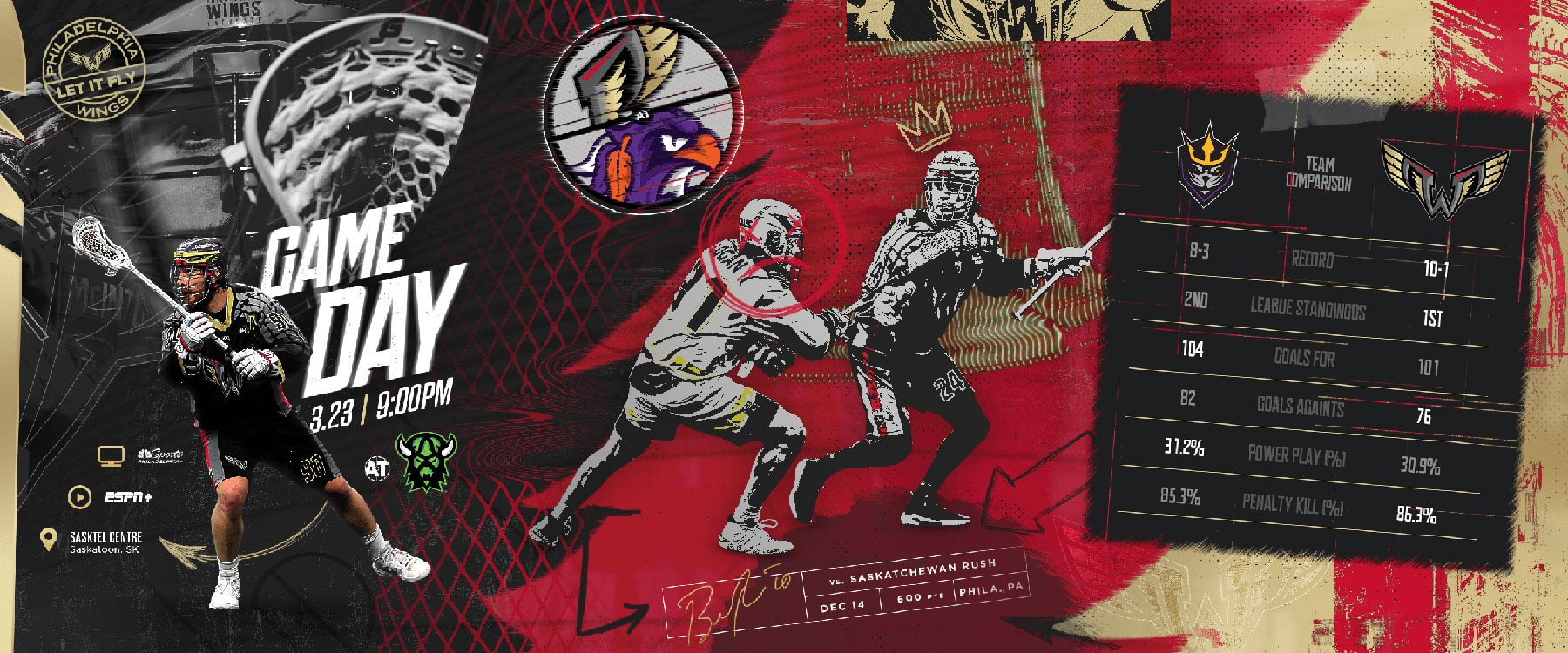
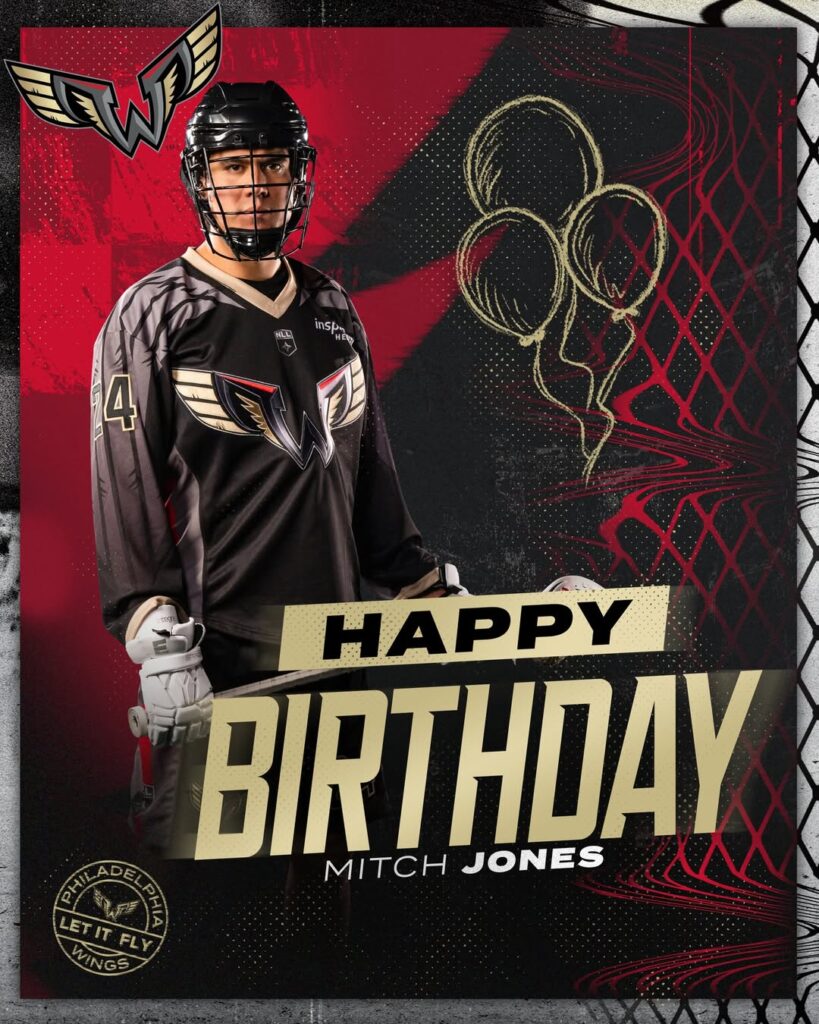
Below are examples of use cases for our creative showing how the various elements and textures may be used. Feathers and wings can be used to transition from one color to another or used as an image cutout. Gameday graphics are broken up into carousels that show the chaos as individual panels though if you take a step back the full composition is shown and flows together.

LET IT

FLY!