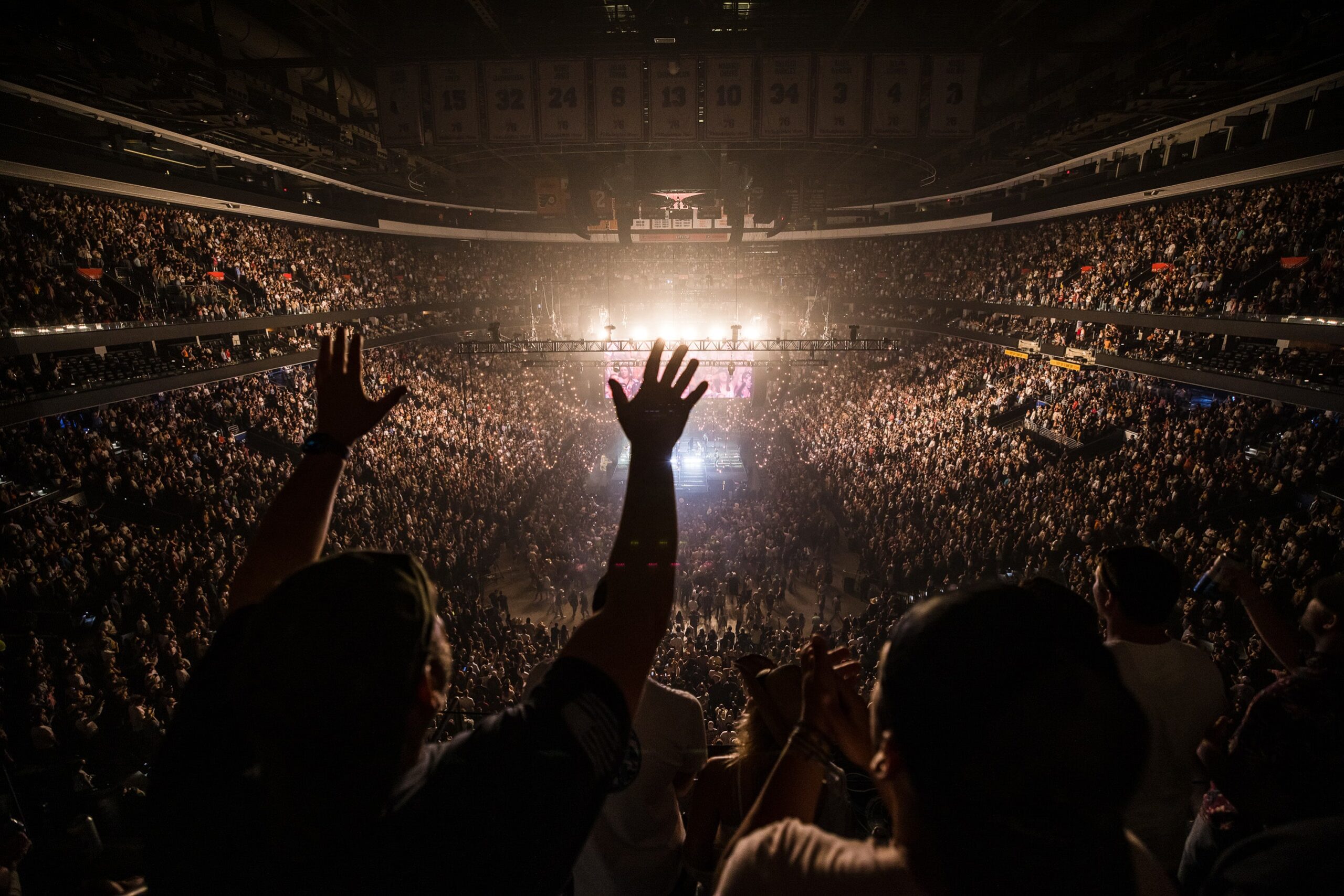
A shootout goal for the win by a rookie phenom on the ice. A buzzer beater three pointer over the rivals from up north. Travis Barker nailing a drum solo while suspended over a massive crowd. Monster trucks flying off jumps constructed the day before. This wide variety of events happen constantly within these walls. The Wells Fargo Center was in need of design direction that celebrates the diversity of events it is home to while retaining a consistent and recognizable brand.
(and agile - more on that later)
A shootout goal for the win by a rookie phenom on the ice. A buzzer beater three pointer over the rivals from up north. Travis Barker nailing a drum solo while suspended over a massive crowd. Monster trucks flying off jumps constructed the day before. This wide variety of events happen constantly within these walls. The Wells Fargo Center was in need of design direction that celebrates the diversity of events it is home to while retaining a consistent and recognizable brand.
(and agile - more on that later)
WHERE EVERYONE PLAYS
As the home of Philly sports and entertainment, we welcome the city into our building and our designs. When an artist or event is coming to Philadelphia we want everyone to think of the Wells Fargo Center.
Every team, artist, act, and event that plays here has their own unique story and audience to be celebrated. We have built our brand to help tell each of these stories while crafting continuity and recognition for the Wells Fargo Center while our chapters overlap. We use a suite of gradients to help adapt to the variety of admats and team colors a stadium encounters. These partner with consistent design templates and typography uses to provide stability to our marketing needs.
We marry elegance and grit as we push our designs to align with the elevated experience we aim to provide to our dedicated and passionate fans.
Our suite of gradients, photography, textures, and typography work together to create agile and adaptable brand elements that remain recognizable across our many mediums. With the announcement by Wells Fargo that they would not be renewing the naming rights to the stadium, it was essential that we create a brand that could easily handle a potential transition to a new name and core colors. Our brand guide below dives into the significant number of needs and design decisions we made to help streamline our process and create consistency.

MARKETING TEMPLATES
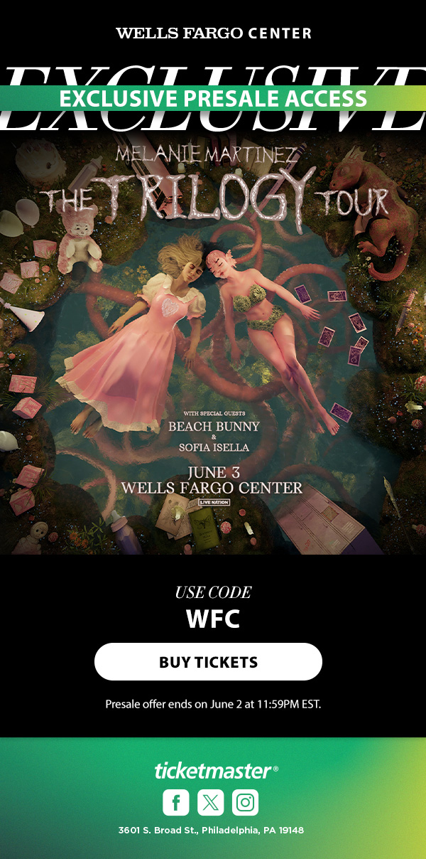
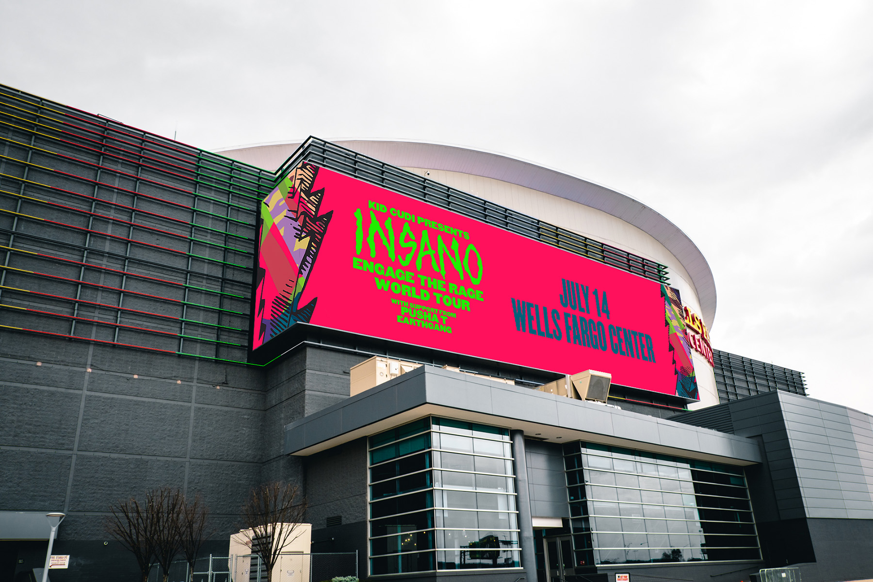
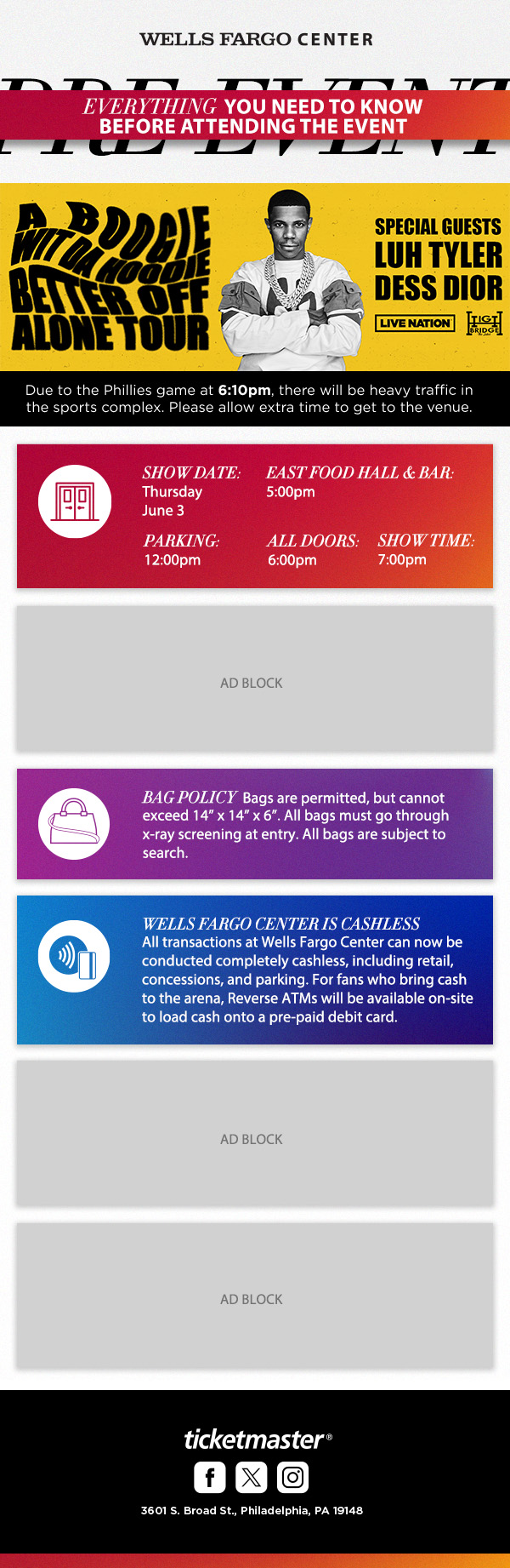
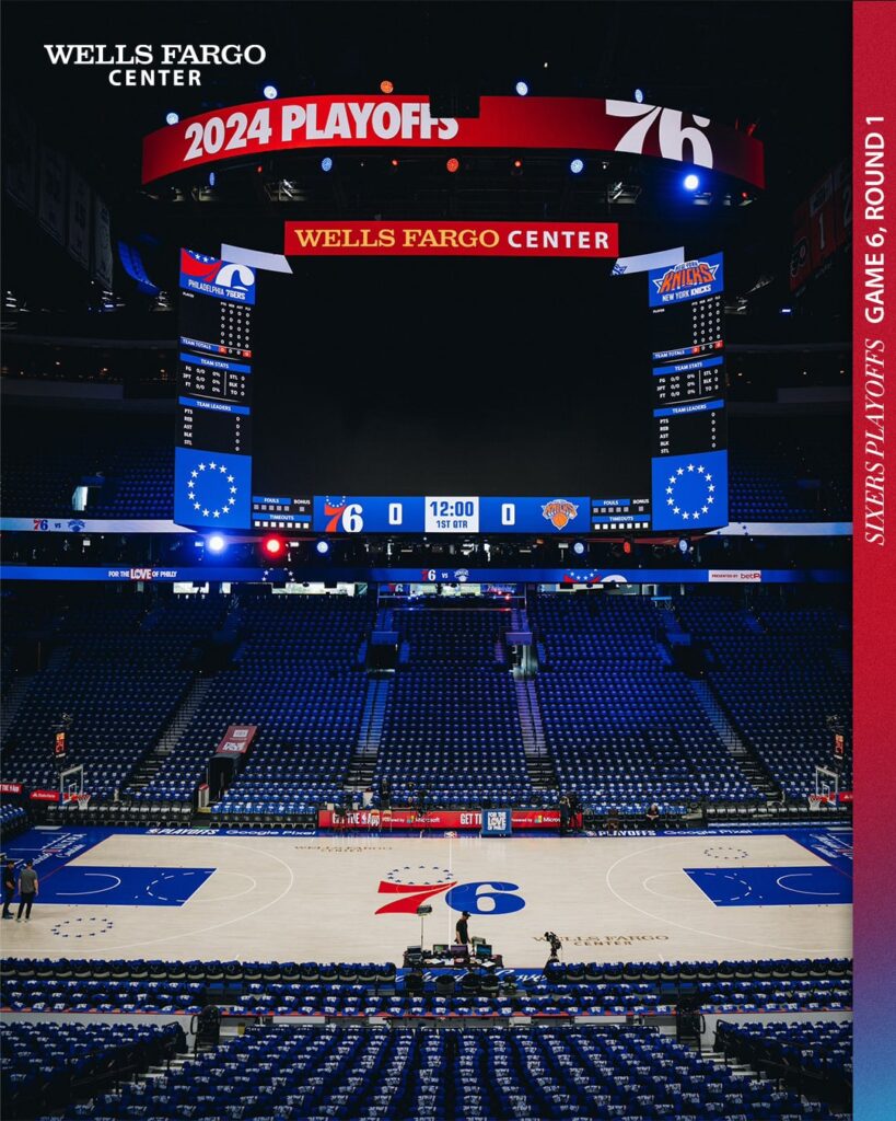
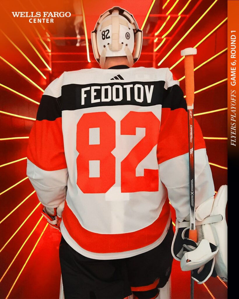
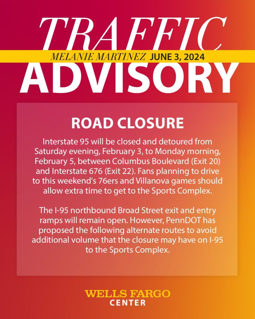
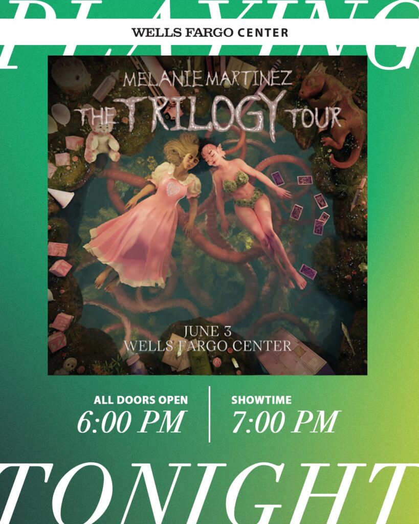
Though we strive for brand recognition in our designs, emails and exterior boards must be sure to put the artist front and center as the creative was developed to promote their story. Secondary elements such as the header, footer, and detail sections are areas where we can overlap our stories and add Wells Fargo Center branding elements.
SOCIAL GRAPHICS
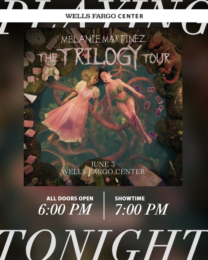
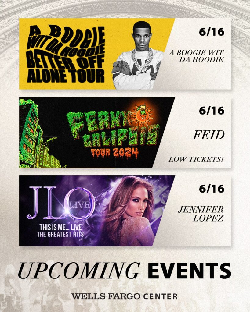
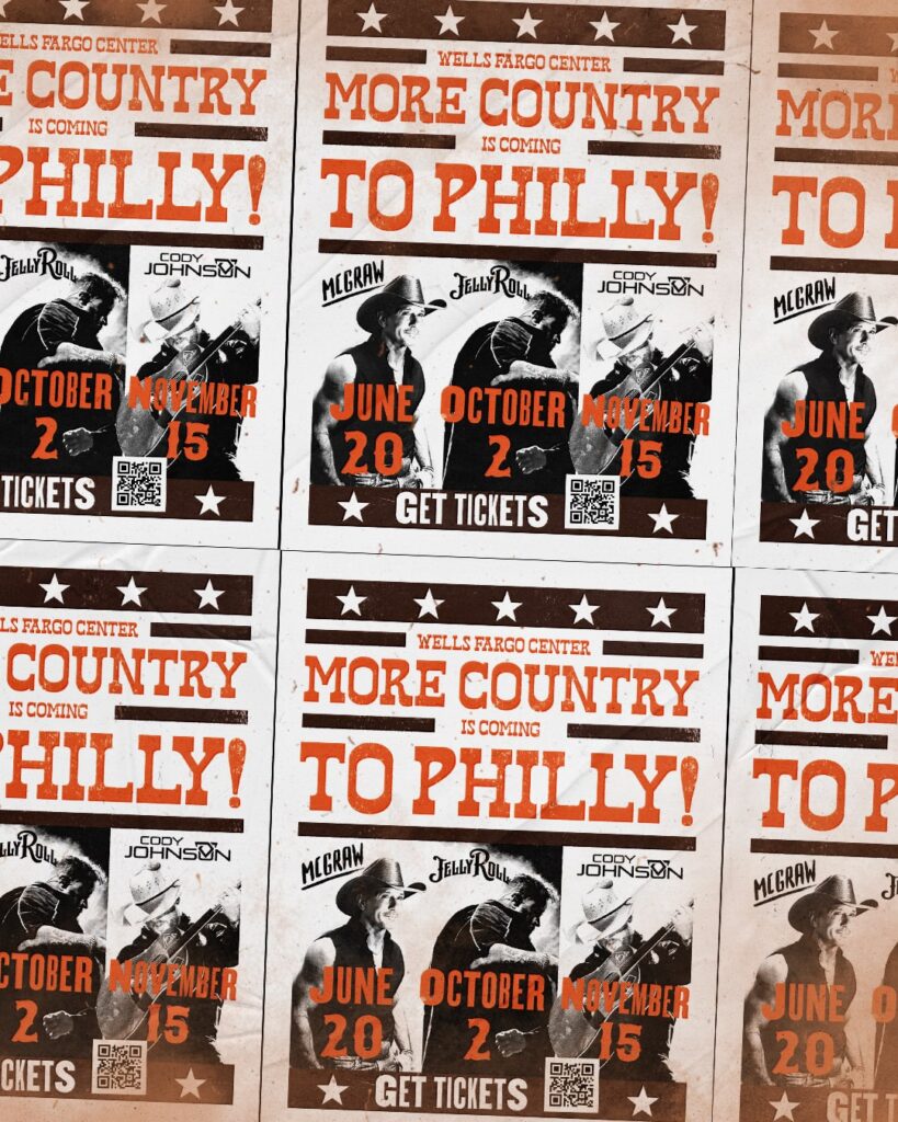
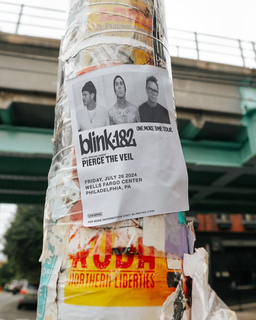
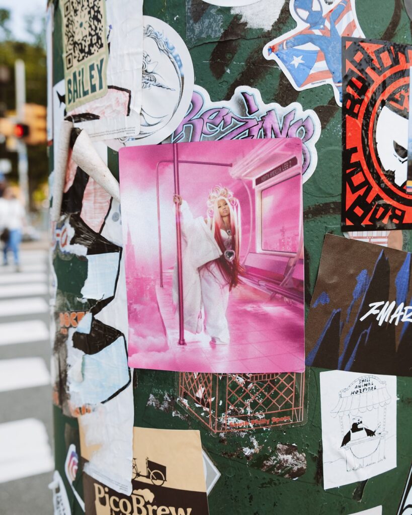
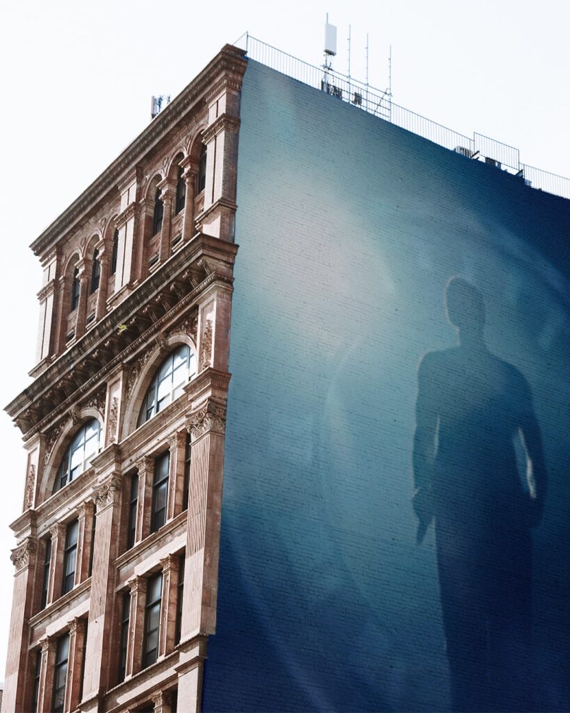
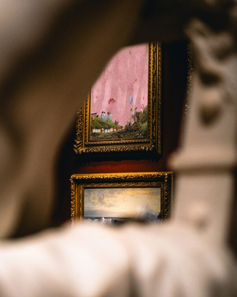
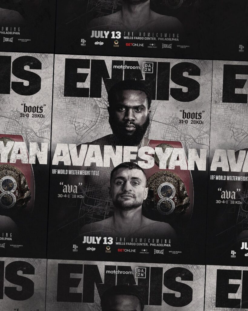
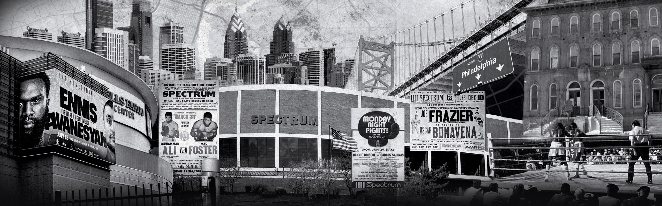
When diving into other stadium's socials I was met with the same feed over and over. The vast majority were simply taking the artists' admats and calling it a day. Our goal was to breathe our building and our city into our social graphics. We used the artists' admats to continue to push their story, but add subtle twists and additions of our Wells Fargo Center branding for consistency and recognition. We created posters highlighting groups of events. I took blank posters and stickers around the city to photograph and create templates to place admats within the cityscape to showcase that these artists aren't just coming to our building, but are becoming a part of our city's story. Known for being a gritty city, we created wheatpaste mockups for the admats we received, giving some texture and life to our feed.